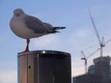
The desaturation is due to being shot early in the morning, and I like the effect. But, I did increase the saturation which brought out more of the blue and lifted the clouds a little. This is the reposted picture. Thanks for the feedback!
now this is a good shot. i like the way seagul is looking at the camera. you should consider buying a polarizer for beautiful blue colors. this shot has almost desaturated feel to it. nice shot nonetheless. -Abstract
dvd_luvva
22-May-2005 00:07
Hi Paul
It is a small world! I work in an office block a little further down Kent St. When I was shooting around Circular Quay I met Marco Nero, a Canon Talk regular. He noticed my Pro 1 and came up for a chat.
I agree with you that the other two pictures aren't as strong, or as on topic. I am pleased with the Opera House one though, because it's an unusual view of a heavily-shot subject.
Paul
21-May-2005 23:48
Would you believe it? On friday i was working on the site which is the foremost of the 2 sets of cranes in the background. If you panned down a bit you might catch a bloke leaning on his spade...err..working hard that is.
I prefer this out of the 3 as i don't find the others give that much disproportion and they just appear as close up photos with a recognisable background. I've had the same problem with all that i've been trying to shoot. Nice to see some of Sydney though