


|
|
|
|
|
|
| |
| 05-SEP-2004 | Paolo |
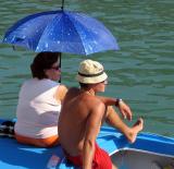
Took durung the annual historical regatta, the most important and ancient Venice's boat competition.
| comment | |
| ctfchallenge | 31-Dec-2004 18:13 | |
| Paolo | 30-Dec-2004 11:44 | |
| ctfchallenge | 30-Dec-2004 06:01 | |
| ctfchallenge | 29-Dec-2004 23:35 | |
| ctfchallenge | 28-Dec-2004 07:13 | |
| Paolo | 26-Dec-2004 13:35 | |
| ctfchallenge | 26-Dec-2004 05:18 | |
| ctfchallenge | 25-Dec-2004 09:58 | |