photo sharing and upload picture albums photo forums search pictures popular photos photography help login
ctfchallenge | all galleries >> Challenge 70: Framing >> Challenge 70: Exhibition > Wicker basket (original)*
previous | next
03-OCT-2004 Rose

Wicker basket (original)*

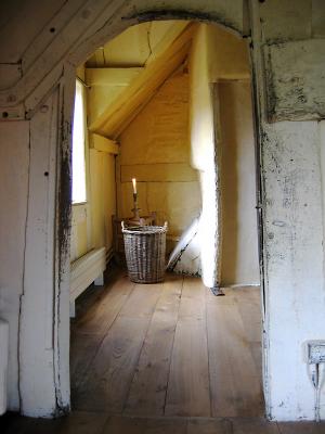
The previous image seems to have sparked off an interesting debate !

Here is the original.
The only processing I've done is a tiny levels tweak and light sharpening in FocalBlade.

Canon PowerShot A80
1/10s f/2.8 at 7.8mm hide exif
Full EXIF Info
Date/Time03-Oct-2004 11:07:42
MakeCanon
ModelCanon PowerShot A80
Flash UsedNo
Focal Length7.8 mm
Exposure Time1/10 sec
Aperturef/2.8
ISO Equivalent
Exposure Bias-0.33
White Balance (-1)
Metering Modematrix (5)
JPEG Quality (6)
Exposure Program
Focus Distance

other sizes: small medium original auto
comment | share
Rod 14-Dec-2004 10:14
It's strange how the brain gets attracted to overdone things, by over saturating colour shots it can make the original look dull when viewed together. I think this effect is what’s happened here with me viewing the graphic shot first & then this one. Logging on today this shot looks very good, at first I thought Rose had give it a treatment but it's the same shot. Unlike me Jude didn't let the overdone graphic fool her:-)
jude13-Dec-2004 22:43
What I like better about this one is the little bits of darkness around the bottom and corners of items.. they seem to be missing in the other and I think it gives the photo depth..
Rod 12-Dec-2004 05:27
Flicking back & forth with the graphic & this one, the graphic looks sharper & has more contrast. So maybe that's all this shot needs to make it work.
Rod 12-Dec-2004 04:09
This shot is quite good but it is lacking something, so I suppose it is a candidate for an action or the bin:-) Your judgement was right Rose. I think the best thing for a shot that doesn't work is to try & re-shoot & learn how to make it work. (Advice I need to follow as well)You have turned a reasonable photo into a good graphic not a good photo. Well done Rose:-)
ctfchallenge11-Dec-2004 16:43
It's a hard call...I like both of them (even though I originally suggested a bit of sharpening). It really comes down to the particular feeling you are trying to convey. Thank you for showing both.

Mary Anne
Techo 11-Dec-2004 05:00
I like both images, but like this one for the fact it's more like a photo than a drawing. Artisticly speaking the 1st posted image is really great, I do like the grit which Lonnit speaks of, it gives off a more aged like appearance.
Guest 11-Dec-2004 04:09
Like I said - you really knew what you were doing when you chose the effect on this image. The character of the shot is missing here. The texture added the grit of life and time and made it special. Excellent work, excellent decision. :) ~ Lonnit
ctfchallenge11-Dec-2004 02:16
I like the processed image better. The bright wall here draws the eye away from the basket, and the floor looks too smooth - it's just an old room. With the processing, the textures are so strong, you can't help feeling like you're in the room picking up splinters. - Walt
Techo 11-Dec-2004 01:14
Hi Rose. I like this one so much better! IMHO, I would just remove some of that purple fringe visible on the left side of the window. Try going over that part with a desaturation sponge, that should help.
Guest 11-Dec-2004 00:49
i guess i should have waited to make my comment on the other shot. i like the other one so much better. this one seems rather blah to me. thanks for posting it so we can compare.