photo sharing and upload picture albums photo forums search pictures popular photos photography help login
ctfchallenge | all galleries >> Challenge 66: Comfort Zone >> Challenge 66: Eligible > White Simplicity *
previous | next
13-OCT-2004 Shu

White Simplicity *

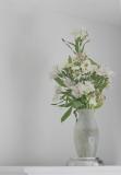
As much as I love to use bright colors in my photography, I live surrounded by white. This is my comfort zone.

Canon EOS 10D
1/45s f/4.5 at 50.0mm iso200 full exif

other sizes: small medium original auto
comment | share
Guest 18-Oct-2004 02:57
Shu - I really like this image. Nice feel to it. I still haven't made up my mind on the crop idea. Anyway, great shot. Mark
Rod 16-Oct-2004 00:21
I agree with Victor that just a straight crop would take away the space of the shot. I think what I was trying to say is I find the corner of the table takes a little away from the simplicity of the shot, as it's something else to look at.
Canon DSLR Challenge15-Oct-2004 15:26
I don't agree with Rod's suggested crop. Abstract's suggestion to tone down the bright front of the counter was right on, and the modification to the image is much better. I also like a couple of the subtle aspects of the picture: that the corner of the wall/ceiling go to the corner of the picture, and the shadow of the arrangement on the wall balances the arrangement itself. I'd personally like to see more detail in the flowers, but I wouldn't want to see that at the expense of the nice, soft look. If it were me, I'd probably apply a selected USM followed by a gaussian blur immediately faded to a level that applies the right amount of softness for what I'm going for. I don't think the end result would be much different from what we see here except that more detail would be apparent in the flowers. -- Victor

P.S. My dad would remove the wilted leaf at the bottom. But I kind of like it there.
ctfchallenge15-Oct-2004 15:01
When I cropped this image, it appeared too large. I want to create a sense of distance, which is part of the message I want to convey. Shu
Rod 15-Oct-2004 11:54
I've noticed a tendency here to place subjects too far to the left or right of a shot which makes them all seem a bit similar. Cropping the left part of the shot out so I couldn't see the corner of the table made the shot more harmonious for me. Nice shot Shu.
ctfchallenge14-Oct-2004 12:11
much much better. i like it. -Abstract
ctfchallenge14-Oct-2004 04:10
I darkened it a bit. If still not ok, let me know. Appreciate it. Shu
ctfchallenge14-Oct-2004 03:11
Nice image shu. I like the simplicity of the shot. but i found that bright white table border a little distracting. takes my focus away from flowers, the main subject. just my 2 cents. -Abstract