photo sharing and upload picture albums photo forums search pictures popular photos photography help login
ctfchallenge | all galleries >> Challenge 65: Minimalism >> Challenge 65: Eligible > Simple Curves *
previous | next
10-7-04 Jim B (MSP)

Simple Curves *

Medina, Minnesota

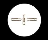
Simple curves seen by most of us every day.


other sizes: small medium original auto
comment | share
Jim B (MSP)10-Oct-2004 21:11
Thanks to all for the comments. I've played for a while with different crops, different colors in the background, etc. I like this version the best. It effectively produces a crop, but it keeps the presence of a "simple color", black, in the background.
Jim
Rod 10-Oct-2004 12:15
I wish Nico had told us what you just did Mark. It would have saved Nugar & me from going all arty, & Nugar disagreeing with me....I'm stunned:-)hehe
Guest 10-Oct-2004 05:57
Rod, one could say that minimalism in photography is created by simply using less rather than more to be effective. A design wherein the subject is reduced to its neccesary elements of function and form. In painting, one uses a limited number of colors to create their masterpiece. In photography, we tend to use a limited number of "props" or focus on a single subject or object. HOpe that helps? Markjay
Nugar10-Oct-2004 04:57
I mostly agree with Rod, but just for the heck of it, I'll disagree. I think the problem is not the white, but the excessnegative space. Maybe a crop of the white area would help making the shot more balanced.
Rod 08-Oct-2004 21:44
Jim, until Nico explains a little on what minimalism is regarding photography I'm still in the dark. All the examples on the linked sites were paintings I saw no photography. All I've kept in my head to help me is the words graphics & bold not really detailed. Your clips shot is subtle, so maybe that's what I'm on about making it more graphic. One of the minimalist paintings was a third red on the left a third white in the middle & a third red on the right, no details. Another was just a black canvas. Mmmmm, maybe just remove the paper clips from the shot & you have a winner:-)
Rod 08-Oct-2004 21:25
Don't listen to Dorys, it's a girls trick to make sure her shots win. (that she took last year):-)
Guest 08-Oct-2004 16:59
Not to disagree with Rod (because no one would ever disagree with him) but for the purposes of this challenge I think the white background keeps the shot "minimal." But then again, agreeing with Rod as all good girls should, you should do what you like best... :-)
Jim B (MSP)08-Oct-2004 13:28
Rod,
Thanks for the comments; I understand your points. I've played a little with this, and would like to play more. I like your idea of adding color. I'll look into it.
Jim
Rod 08-Oct-2004 10:53
Good shot Jim the clips appear to be floating. The large area of white I'm not too comfortable with. I had a couple of thoughts which could end up looking terrible:-) The first thought was a coloured background other than white with another colour as a stripe from left to right across the middle of the shot wider than the middle clip.(clips on top of course) The second thought was was to colour almost the whole of the left side one colour ditto with another colour on the right with a third colour from top to bottom just wider than the middle verticle clip. Each clip would appear on top of it's own colour. Geez If I read this on one of my shots I would just throw the shot away:-) In a nutshell, I really like the shot not the white background:-)hehe