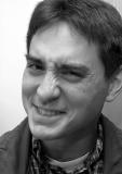
The soft lighting was created with a 420EX tilted at 90 degrees.
The background contrast is unfortunate, but I wasn't sure if I wanted to 'doctor' the picture to tone down the left side. Besides, I wasn't sure if I could technically do it anyway (have to mask around the hair). I'll give it a whirl, though.
Gordon Lai
12-Apr-2002 18:33
Thanks for your comments. This image was the last one I took in about a dozen shots. In the others I had told him to smile, but he said he couldn't really smile naturally unless there was a funny situation. I kept bugging him to smile until he pulled this face and BAM! I got it!
I agonized over the cropping on this one. I tried including the whole head and ear and also cropping to exclude most of the hair and ear, but I decided that the above was best. I'm not sure how to describe this, but because I wanted to show that he was 'mad' and 'frustrated' (although he wasn't really) at my picture taking, I cropped it so that it looks like he canted his head out of the frame. Does this make sense? Also, I thought cropping closer was too much; I wanted to keep most of his ear and show the shape of his hair.
Because he canted his head and is sort of now looking to our left, I left space for him to look that way. I had tried cropping tighter also, but that seemed to not give him breathing room.
I love the expression. And the soft lighting really emphasizes the wrinkles caused by it.
I think maybe if you cropped it more on the left, it would be stronger because there would not be such a big white empty space. I tried it cropped to the left all the way up to the cheekbone, and I think it works a tiny bit better. The difference in tone between the background on the left of his head (almost pure white) and the right of his head (medium grey - shadow?) is a bit distracting, and I wonder if you could correct it in photoshop?
Lots of personality in the face, good portrait. Makes the viewer feel they have
some idea what the person is like. (even though it is probably totally wrong :)
The framing is a little bit too tight, or not tight enough. You lost a bit of ear and a bit of hair/head. In closer would work too.
In general it is very well done, and close in though - better to have filled it too much than not at all.