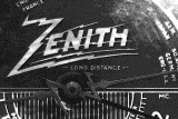
Thanks for the comments. I considered adjusting the highlights, but the radio has lights behind the dial at the corners and it pretty much looks like that so I left it. -- AussieDawg
Interesting composition and one that really makes a 'statement'.
The extreme 'noise' really draws one's attention. I am not really a fan of blown highlights but it seems to fit with the textures here.
I would however, be inclined to ease the highlight around the lettering a little so as to be able to actually read the letters. That is just my preference and of course the intention of the Artiste is the important thing here.