


|
|
|
|
|
|
| |
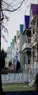
| 03-FEB-2008 | Penny Street |
| Canon DSLR Challenge | 05-Feb-2008 22:19 | |
| Canon DSLR Challenge | 05-Feb-2008 16:21 | |
| Canon DSLR Challenge | 05-Feb-2008 01:15 | |
| Guest | 05-Feb-2008 00:43 | |
| Canon DSLR Challenge | 04-Feb-2008 23:22 | |
| ctfchallenge | 04-Feb-2008 19:08 | |
| jnconradie | 04-Feb-2008 06:13 | |