This gallery includes an image that meant a lot to me, Venice: http://www.pbase.com/cslr_challenge/image/86985736
It's an obvious and common shot of Venice but I was so pleased with it. Pleased to be in Venice, please to have the right weather, the pretty girl taking a photo of the gondolier in full regalia, even the pigeon flying through the scene (although it looks more like sensor dust on the oof version).
For the challenge I decided to take the image oof. I tried lots of things but nothing worked and it all seemed contrived. Then I decided on an OOF versus Saturation ratio. Pops posed the question 'how much oof'? I decided to compensate the oof with saturation. For each percent/radius oof I increased the saturation proportionally. Once a colour became blown, I reduced it slightly and that became the oof limit and the answer to Pops question. Despite receiving no comment (and so is probably hated, or worse, ignored!) I was very happy with the result. The increased saturation really did seem to compensate for the reduced detail, to some degree.
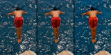
So I decided to repeat the experiment with the above image: On the left is the original. This has a few things going for it. The colour contrasts, the symmetry of the back, the shoulder muscles, material detail in the shorts, the glistening water (which is much further away than it looks, but I used too large DOF), but mostly the feet. So I blurred the image with a 9.8 radius. That's the middle image. For me it lost all it's appeal. It has almost nothing going for it. So I increased saturation in proportion. The torso regained it's symmetry, the shorts, while still lacking detail, gained a vibrance, even the sea recovered some of it's intricate patterns, but mostly the feet return to centre stage. For me this confirmed the impact the changes to Venice shot had. OOF dulls the shot, saturation recovers it.
What do you think?
Please do not delete, update, or otherwise edit others' entries
* Submitter retains all copyrights *