photo sharing and upload picture albums photo forums search pictures popular photos photography help login
Canon DSLR Challenge | all galleries >> Challenge 69: Greyscale (host: Jim Harrison) >> Eligible > bushy
previous | next
05-JUN-2006 © Olaf.dk

bushy

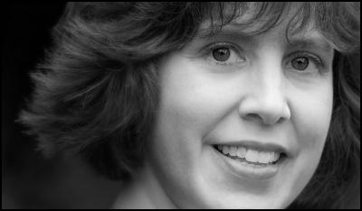
Cropped from a head and shoulders shot. Black and white conversion was done via a channel-mixer layer on top of a hue/saturation layer at partial opacity where I adjusted the hue. Color version can be seen here.

Canon EOS 20D ,Canon EF 135mm f/2L USM
1/400s f/2.0 at 135.0mm iso100 hide exif
Full EXIF Info
Date/Time05-Jun-2006 16:25:04
MakeCanon
ModelCanon EOS 20D
Flash UsedNo
Focal Length135 mm
Exposure Time1/400 sec
Aperturef/2
ISO Equivalent100
Exposure Bias0.33
White Balance (-1)
Metering Modematrix (5)
JPEG Quality (6)
Exposure Programaperture priority (3)
Focus Distance

other sizes: small medium original auto
share
Canon DSLR Challenge13-Jun-2006 19:56
Digital Stray Hair remover you say? ~ Lonnit
Guest 13-Jun-2006 17:08
In spite of the title, I decided to remove three stray hairs (using the digital stray hair remover).
Canon DSLR Challenge08-Jun-2006 00:15
That definitely is an improvement - although it might be blurred just the very slightest tad too much. Oh, BTW, if you're going to readjust, you might just want to take out that one stray, light hair just to the left of HER right eye, - the one that goes vertically to the top of the frame. ~ Lonnit
Guest 07-Jun-2006 05:24
Thank you Lonnit, I really appreciate your candor! I agree about the texture of the 'wild' hair being a distraction, especiallly in the black and white version, but disagree on your idea of what to do about it, so I've chosen to blur the hair some instead...
Canon DSLR Challenge06-Jun-2006 21:56
Olaf, as you know I respect your abilities, so I'd never consider pandering to you - I'm going to be blunt here and simply say (although, yes, the changes you've made are a big improvement) that I simply find the image dull. I am appreciating the lovely eyes and teeth more now, with the changes, but overall, I'm bored by it. What does work well for it, is cropping it just below the nose so that all we get is a long strip with a smile at the end. The smile becomes a lovely payoff as we scan across the image to rest upon it. As it stands now, the hair has become a huge focal point for me, but it is an unappealing story of hair - with the color gone, it becomes a statement about the texture, which is sharp and bluntly cut, as opposed to soft, sexy, or luscious. I'm sure it's very nice hair in person, but it's not coming across that way in the image, and it's a huge focal point. I do very much like it if you cropped as suggested. It makes for a very intersting composition with a pleasing subject. ~ Lonnit
Guest 06-Jun-2006 21:15
I cropped a little more off the top and right sides plus added a thin black border to separate it better from the background. The originally posted version can still be seen in my own galleries:http://www.pbase.com/olafdk/image/61374408
Guest 06-Jun-2006 18:51
Thank you Nico! In this particular case, I was experimenting. She was casually wearing a red and black rain jacket that just didn't seem right for the picture, so I was trying to see if I could get away with an unconventional framing. Anyway, conventional seems to be... well, boringly conventional. And to your question on gut feel or logic, I must say it is the former which has determined the placement of the four sides of the frame. Asymmetry is a balancing act which can be very rewarding, if or when the right balance is found. I am not saying I've found that balance here. In fact, looking at it now, I think I must crop off a bit more at the top to be able to justify cutting into her chin...

Cindy, thank you! I find black and white particularly good for portraits, so a portrait was my first idea for this challenge. With that said, I must agree with you and answer: "Probably not." Then again, the color version you've seen would not have looked like it did had it not been for this black and white version. You see, I used this black and white version of the shot to get those pleasing and smooth skin tones in the color version. I added this as a layer on top and set it to luminosity blending mode (at some partial opacity). Without it, the skin was darker and less perfect (she was wearing no or very little make-up). I was experimenting with this, with the crop and with the black and white conversion - and so making this photograph has first and foremost been a learning experience, trying to push my limits...
Canon DSLR Challenge06-Jun-2006 15:46
Lovely portrait. I like B&W portraits for many subjects - particularly when the light was difficult, the skin red, distractions in the clothing or background, or when the character of the face just seems to be captured better in B&W, etc. None of those things seem to be the case here . . . she has a lovely complexion, and gorgeous eyes in nice light in a pleasing setting. Your conversion was perfect . . . but would you have presented it this way outside of this challenge?

Cindy
jnconradie06-Jun-2006 07:16
Nicely done, Olaf. I also visited the colour version and the rest of that gallery. All excellent.

I seem to really struggle with figuring out when to do portaits in the more traditional "vertical" style, and when to chop some parts of the top and the bottom so that it fits into this "horizontal" style. Is it just "gut feel" on your side, or is there some type of logic/rationale that made you decide to use this crop here, for example, rather than a "vertical" version? It is not a criticism, just a question. :-)

Regards ~jnconradie