Many thanks for comments, everybody. So, the opinions are divided.
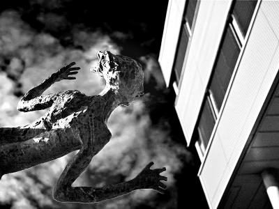
RK: thanks for observation, this is what made me to do the conversion: spirits should blend with environment, right? But, this makes for the very messy thumbnail
Mr. Biscuit: thanks for suggestion, I shall definitely try it
Doctah: This was a quick attempt, I should work more with conversion
Richard: thanks for appreciation
Much prefer the color image, though an idea to offer. Layer the B&W atop the color original, set the blend mode to Luminosity, and dial in the right opacity. Perhaps mask the building, so it doesn't get the treatment (or full treatment). Anyhow, a trick I learned from Grant, and one I use often to give color images contrast and more film-like character. --Mr. Biscuit
That's funny. I was thinking that I don't like this conversion at all. The blown highlights on the back of the head are especially problematic for me. Plus the sky seems unnaturally dark. -Doctah