Commenting on this page requires a PBase account.
Please login or register.
Guest
22-Feb-2006 13:22
Yves, thanks for the input. I agree with you about the saturation. I think the additional richness adds to the depth of the image. I also burnt in the left edge and I agree it could use some more. However, I think you've cropped it a bit too much, somewhere between mine and yours might be best.
This is a neat idea... the only thing is that the perspective points to an uninteresting wooden panel, and I'd suggest cropping much tighter and adding some color punch. In the example I worked on, I duplicated the layer to overlay and blured it by 5 pixels. I also burnt the left side of the picture. Feel free to write me, I'll be happy to share more.
Really nicely done, Pops. All of the horizontal components play to the perspective while the vertical elements are a nice juxtaposition, all set off nicely with the square presentation. -Michael
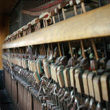
Guest
13-Feb-2006 15:29
Alas, this piano has played it's last sweet note long long ago. It sits on the porch of a local restaurant and is exposed to most of the weather. It is in the process of slowly falling apart. The front of the piano is missing entirely.
What a great way to depict perspective! I am guessing from your title that the hammers that are out of alignment would not play correctly. How did you get enough light into the back of the piano to take this picture? Good work! ~Sharon
Guest
13-Feb-2006 00:58
Now there's a comment that will simply confuse everyone unless we put it in, er, perspective. Lunch was great, Photocat has a very interesting idea. Good food and good friends, what could be better!