I have to say I just hate re-using images that I have already presented and I usually do it when I become tired and uninspired ,but I have done it in the past.
I did think of those images,but I guess I would be repeating myself.
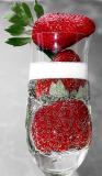
The strawberry shot is not that original,so I was mainly looking for colour and effect.
The bubbles gave me some sort of pattern,although I was looking for more I just ran out of time.
Graphical images to me are more along "arty lines" such as Andy Warhol and borders on commercial Art.
I picked up a few mags and realised how good these people are at presenting their work.
Not only were they colorful but they gave you a sense of feeling.
Repeated patterns seem to be a favourite in this challenge but it just to me did not totally convey a grahical image.
In short I see graphics as colorful,contrasty,sometimes neutral and a little on the surreal side,conveying feeling and mood in a different way and not entirely geometrical.
Beautifully taken, love the green/red combo and the bubbles in the champagne make it graphic with repetitive patterns followed by the strawberries itself. Very interesting take on the photoGRAPHIC challenge, I like your interpretation. ..... Vikas.
Eric, when I thought of the theme for this challenge, your excellent high-contrast, behind-blinds kind of shots inevitably went by on my inner retina. Those shots were part of my own definition of a graphic photo. So it surprises me to see this as your interpretation of the theme. Nothing wrong with the photograph, don't get me wrong! But I would very much like to hear your thoughts on what constitutes a graphic photo - in words! --Olaf