photo sharing and upload picture albums photo forums search pictures popular photos photography help login
Canon DSLR Challenge | all galleries >> Challenge 21: Head & Shoulders (Hosted by Karthik Murugesan) >> 21 Eligible: Head & Shoulders (Hosted by Karthik Murugesan) > Shadows and Light * by Jerry Turner
previous | next
03-AUG-2004 Jerry Turner

Shadows and Light * by Jerry Turner

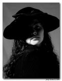
I love how the light throws a line of shadow across her upper lip. It makes it look so dark and mysterious.


other sizes: small medium large original auto
share
Canon DSLR Challenge09-Aug-2004 09:19
FWIW, I like iso's darker version the best. --Olaf
iso320009-Aug-2004 08:41
Thanks for your email Jerry. I don't make a habit of this but I know Joe and Olaf have experimented in this way. Checkhttp://www.cedarmedia.net/copper/thumbnails.php?album=5 for a slightly reworked version.
iso320008-Aug-2004 22:11
Hi Jerry. I saw the original and was intrigued by it. I had to know if I could make the image work how I envisaged it so I took it into PS and did my own mono conversion on it, and I like the result. I have the eye still in shadow, and have cleaned up the noise and the whole thing to me is visibly sharper. With your express permission would it be cool to post the image results on the challenge thread?
Olaf.dk 07-Aug-2004 19:41
Works for me! I really like what you have achieved with this shot in post! You could look at it like this: It's a classic woman-and-hat-shot - where you are looking down at the shade which is hiding the eyes - but with a twist, here you get a hint of her face as a bonus. --Olaf
Guest 07-Aug-2004 07:48
Iso, I really appriciate you being open and honest, that is why I added the *. The contrast was done intentionally to add mystery and question about the rest of the face. Looking at the image again, I like the minimal light on the right side of the face, but the left side of the body. It adds a balance.

Just for a reference and of course open opinions, here is the reference image -http://www.pbase.com/image/32270317
roberta07-Aug-2004 03:42
Jerry,
The pose and angle of the shadow really grab your attention. I think I'd like to see a bit more detail on the right side of the image. It definitely demands a second and third look.
Canon DSLR Challenge07-Aug-2004 03:05
I'm glad you happened by, Iso, b/c I was beginning to think I must be wrong here. But then again, how can one be "wrong" in an OPINION! LOL! I'm still relieved to share your similar viewpoint.Phew! When it comes to opinions we're all correct. :) ~ Lonnit
iso320006-Aug-2004 20:49
Adding my bit purely * of course, this doesn't work so good for me. I like a good contrast, but in this instance it looks too overdone. The shadows are filling in too much. The lack of detail to me just says you've simply gone too far with the adjustments, and in this case the image has not benefitted from it. I don't mean that to sound harsh but if we're going to * things let's be honest with our opinions. I'm sure this picture with more detail in it would work better. Perhaps a bit of selective dodging and burning might help with what you're going for without being global.
Guest 06-Aug-2004 15:53
I object to Lonnit's objection. In this case, I like the thumbnail better than the original because it's even more difficult to tell the dividing line between hair and clothing. When I first saw the thumbnail, I thought it was all hair, and I really liked that impression. I wouldn't change a thing about the face, though. -- Victor
Guest 06-Aug-2004 07:36
Thanks for the comments.

I am not sure why, but I seem to take a lot of my pictures are bump the contrast and drop the brightness a bit. I used to shoot B&W film, so that is what I was used to.

Both eyes actually came out in the picture, but I found it more of a mystery with only one in the soft light visable. I don't think that I touched the sharpness of this one, but I probably could just a touch.

Please keep the comments coming.. I may try this one again.. :)
Karthik Murugesan06-Aug-2004 04:09
Well, I disagree with lonnit on this one. While the shadows and lights are working well in creating a mysterious effect - because I couldn't get a sense of the subject for a while - the shadows and light are not appealing. They are rather harder in most of the places. Maybe a little lighter on the shadows, a different pose where she's not looking at the camera, soft lighting etc would've worked well.

- Karthik.
Guest 06-Aug-2004 01:00
I also like how one eye is visible as well. The shadows are working perfectly. The thing I have a problem with is the focus. I'd like to be able to see the difference between hair and sweater as well. To me this should have been a sharp focus shot. It's got great potential though. I'd love to see you shoot it again and work out the kinks b/c it's really got great potential. Great eye on this one! ~ Lonnit
Guest 05-Aug-2004 22:48
It works very well for me.