Commenting on this page requires a PBase account.
Please login or register.
bee1000
20-Apr-2004 17:35
Thanks for the comments, I really appreciate your time! As far as the mystery of the removed letters, I have no answer for you. To be honest, I never even noticed them in the shot. I went back to a wider shot I have of this wall and tried everything I could think of, but couldn't get any letters to show up. It will have to remain a mystery (at least for now).
Guest
18-Apr-2004 04:16
Heheh, I tried figuring it out, too, Lonnit. I even did a lot of tweaking levels, USM with various radii, etc., but all I was able to discern was some foreign alphabet. -- Victor
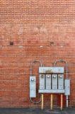
I think the compositieon is perfect. The meters sit right on the lower right instersection of thirds and there's horizontal of the stains on the wall from where the individual sign letters were removed, just below that last clean looking row lock, that sits right on the upper third line.
What did the removed sign say? It looks like there were K, I N, D, to my best guesstimate.
Nice job. ~ Lonnit
Guest
17-Apr-2004 09:13
Without knowing anything else about the subject, it's hard to say what I would change, if anything, about the crop. I certainly wouldn't make it smaller than it is here, unless possibly cutting out the bottom grey area, but that is almost like punctuation to the rest, if you know what I mean. Also this picture has the bricks exactly square with the frame. I don't think you'd want to change that unless you changed it radically. But then it would be a completely different picture. Maybe even a closeup fish-eye view centered on one of the meters. The barrel distortion would give a completely different look to the picture. Depending on the texture of the bricks, an oblique angle to the light source might be interesting, particularly if the meters cast a shadow over the bricks. -- Victor
bee1000
15-Apr-2004 23:16
Do you have a suggestion on improving the composition - or do you think the subject is what it is and there isn't much more to be done with it? The right edge of the photo is pretty close to the edge of the building, so I don't have room to work in that direction. I am planning on revisiting the area I took the shot, so I will be able to give any ideas a try. My timing will find the wall in morning sun, rather than the even afternoon shade of this shot, but I can go back in the afternoon, too. Thanks!
Carlos Chacon
15-Apr-2004 19:53
The beauty of the similarities that do not reach the point of being exactly equal! As Victor noticed in his impressively detailed comment, this shot is really nice in that it shows a pattern that for the uninterested eye might look all the same, but that is indeed very dynamic. Overall, the shot has great color and nice detail. The composition is pretty good too. Cheers!
Guest
14-Apr-2004 13:44
I've never seen a brick pattern like that before. I did notice, though, that rows 15 and 22 from the top should each be one row higher for a consistent pattern. Did the mason screw up? I just thought of something, this is probably a double-brick wall, and every 7th row connects the two layers. I notice also that the color of bricks changes at row 22. I also find myself wondering about the rectangular patch of red below the meters, and the red things on the ground, also the curious squares.
Technically, the picture has nice, even lighting. I think this helps to hold interest in the wall. At first it looks like a simple repeating pattern, but the more you look at it, the more you realize it's got a lot of character. The framing also works very well for me. -- Victor