Commenting on this page requires a PBase account.
Please login or register.
Guest
25-Jan-2004 21:11
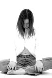
thanks for the feedback. i understand about the shirt. i am a sucker for high key that blows out the clothing. i like the effect of emphasizing the face, limbs, etc. this pic was kind of a tribute to one i took when she was pregnant. you can see it here:http://homepage.mac.com/granthamilton/PhotoAlbum32.html it is the last one in the gallery. also, the first pic in the gallery has a blown shirt as well...;)
Overall I think this one is great. Pose and clothing work wll. Not decided on cropping of the knees though. Guess I'd need to see it both ways. I'm a big fan of hi-key shots so this was going to get my attention. After viewing for a while, I think the shirt highlights that are blown out really need to be there. Her head appears to float in mid air if you look at this for a while. Don't take this crit hard though. For a stylized piece it works well. I just think it would stand better if it were *technically* correct. May well get my vote anyway though :-)
Guest
25-Jan-2004 14:50
i did three things with this image in photoshop. 1. made it black and white 2. dodged her face a little to make it more visible 3. sharpened it.
are you referring to what i actually dodged or do you mean that her shirt is too white?
I like all 3 of your submissions. They are all very technical, maybe a bit to much dodge on this one? I think KP was having a bad day, as we all do.
Rob Mc
Karl P
24-Jan-2004 18:29
Perhaps. Both pictures are really nice, I like them a lot, but to me at least, they don't complement each other. Each one reveals all that was (intentionally I presume) hidden in the other. Most of why I like this one is that the face is hidden. Most of why I like the previous one is that it's just face.
Grant: To each his own, but I have enjoyed your B&W series. Each has a character of its own, each is distinct in the emotion it conveys. Very nicely done. I have specific feedback on the next two... Thanks. --Joe (Host of Challenge 7)
Grant
24-Jan-2004 14:28
did someone get up on the wrong side of the bed today?
Karl P
24-Jan-2004 07:45
myahh, This is not so nice, the previous one was really nice. Maybe it's just me, but I don't really like seeing more of people in later shots. One pic! I don't _want_ to see what the rest of sara looks like. (Or, of course, conversely, I don't _want_ to see what sara's eyes look like.)