


|
|
|
|
|
|
| Andrys Basten | profile | all galleries >> Kindle photos for blog >> Paperwhite-3 screen-text comparison photos with Paperwhite-1 | tree view | thumbnails | slideshow |
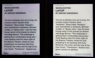
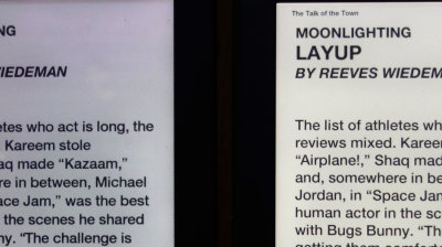
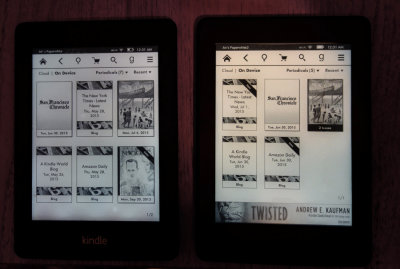
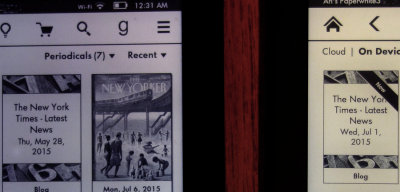
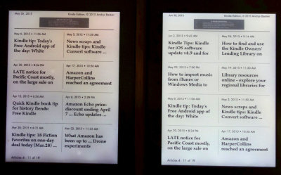
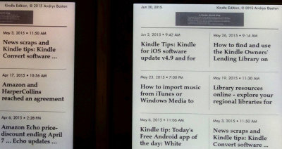
 Comparison of new Yr 2015 Paperwhite-3 screen display (resolution differences and display contrast) with my Yr 2012 Paperwhite-1. Is the higher resolution (double the old model's) worth the $119 to get the newer one? That'll depend on the individual. IF perceived contrast of text against background is more important than sharper text for some Kindle users, it could be better for those owners to keep using the older ones that may be less sharp but they have a dark fuzz around the font making it seem bolder. The Paperwhite-2 (2014)P received a faster processor, but the Paperwhite-1 which I kept using (not upgrading to model '2' last year) is noticeably slower than the new Paperwhite, so I am happy to have the higher resolution and faster speed. Also, I like to increase the font size, and the new resolution with the Paperwhite-3 (UK model here) makes this even more readable than before while doing better with smaller text because of less relative blur (not noticeable usually) in the basic font. In the photo at the left, you can see that the built-in light (set at Level '14') is brighter on the new Paperwhite than it is on my Paperwhite 1 (which had some minor blotching besides on the display in lower light (as you'll see in the close-ups) -- and text against the brightness of the newer model can SOMEtimes appear less contrasty than on the older model. The older model is on the left, the newer on the right. Below are enlargeable photos from the screen comparisons shot from (I hoped), the middle area between them), with both on a table. In my case, the new display is definitely easier on my own eyes. This subgallery is for use with the A Kindle World blog article, which will include in the next couple of days more detail and reaction from mainstream tech writers. This isn't a regular "photo gallery," but if interested in the (or UK model), the photos may help. *** Click on any image to get the larger version. *** Then you can click on "Next" or "Previous" to see other ones. |
| *** ( For FULL SCREEN: PC's, press/toggle F11. Mac's, maximize screen. ) *** |
 mdsc04345r.jpg |
 mdsc04345rc.jpg |
 mdsc04356rc0.jpg |
 mdsc04356rc1.jpg |
 mdsc04371r.jpg |
 mdsc04371rc.jpg |
| comment | share |