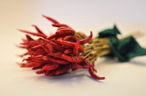
The contrasting colour boundries and limited depth of field make this image hard to look at. If that was the mission, op-art, Walter you have succeeded admirably. Getting rid of the green cleans this right up for me.
Like it a lot, it's a great still life with contrasting colours. Peer is right, the green is a little dominating and maybe I might crop it a little, or crop at the left side so red can balance it?
Guest
04-Mar-2010 08:35
This is very artist, the DOF and OOF regions are stunning. The compoisition is intresting, but my eye tends to leave the focus'd area and move down towards the green. Even though the DOF is very thin, there isn't a single thing to draw the eye, all the chile that is in focus is equal in its eye drawing attention.


Please login or register.