Meter Face Color
49
In building a model of anything, it's easy to get "sidetracked" into exploring the purpose of,
or the reason why something was designed, and made the way it [IS]. Understanding the history
of the standard established for the (volume unit) by Bell Laboratories, and the various broadcasting
companies during the late 1930s, it was not difficult to read and learn about this using the Internet.
Here's what I could not find.
I could not locate information anywhere related to the color of the VU Meter face.
I'm building a model. I need to know this stuff. ............................................................
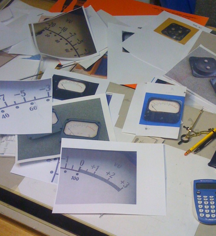
Any radio station I was employed with always had audio mixing boards with meter faces having
a certain color. Tape recorders and other types of audio equipment utilized a similar color with
their meter faces as well. ...........................................................................................
Was it tan, beige, almond, antique white, moccasin, light yellow? The list of colors could go on.
Where did the meter Manufacturer's choice in color originate? And what color is it?
.......................................................................................
November 29, 2010 UPDATE: Two conferences held in June, 1938 at the Institute of Radio Engineers annual
convention in New York established the design of the volume indicator. In addition to the meter's electrical specifications, other characteristics were chosen to
make the instrument readable over long periods with little eyestrain or fatigue. The meter face referred to as a "Scale Card" was designated Cream Yellow with
markings in Black and Red. (Gracious Thank You to Jack Orman for providing documentation from 1939 "Electronics" reprint, McGraw-Hill Publishing Co., Inc.)
Learning About FONTS
50
At 8-years-old in Second Grade Elementary School, I was already drawing pictures
in correct 3-dimensional perspective. Growing up in a house surrounded by Artists, the idea
of doing anything with a piece of paper and a pencil was a "natural" for me. Yet, facing this
VU Meter Scale, and "Font" issue was probably the most difficult aspect of the project.
Painted Drafting Paper
51
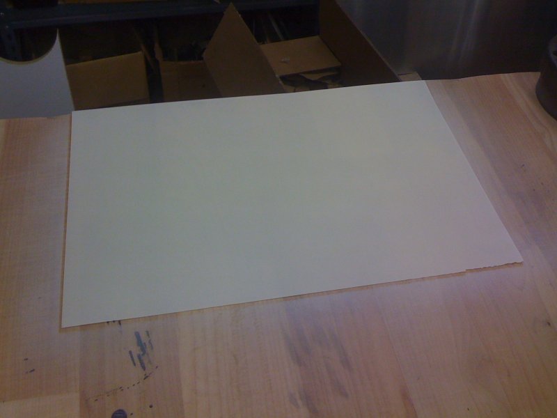
Discovering paint could be applied to "Clear-Print" drafting paper occurred
totally by happen stance. I knew I was going to have to Hand Letter the scale
onto a surface, but I also knew if I could use an ink pen instead of a paint
brush, the result would be far superior. So I painted a piece of drafting paper
to see what would happen to it. Would it shrivel up? Would the paint puddle,
or make some other undesirable result? Would I even be able to still see through it?
Scale Card
52
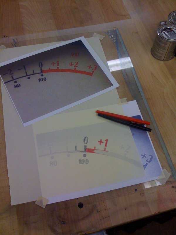
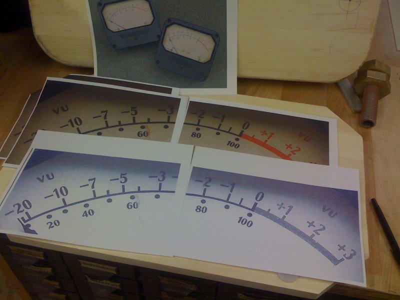
Testing hand rendering of the original Weston Font. Here, the type "A" scale has the "20 to +3" in
larger type on the top arc, and the "0 to 100" on the bottom arc in smaller type.
02-MAR-2008
53
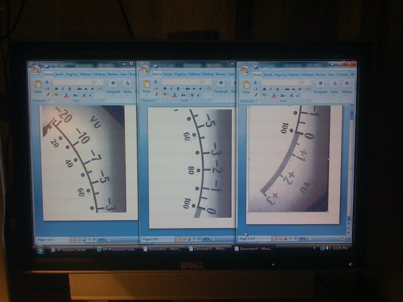
Using the computer, I brought up 3 separate Word Document programs. Carefully
scaling, and resizing an inserted photo of the meter scale into each document,
they were then printed onto a standard 8-1/2 by 11 inch piece of paper.