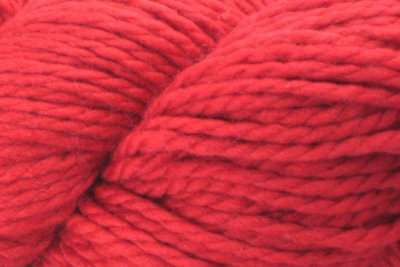
A user in my photography forum, photography-on-the-net.com (POTN) posted a shot of some red yarn and complained that the color was way blown out from the "real" color. Here is my reply, with comments accompanying the images:
This is not uncommon when shooting bright/highly saturated colors in strong light such as a flash or bright sun. It is common with flowers as well as fabrics.
In essence, it's because the camera captures a larger/wider gamut/color space than our systems are set up to handle, so that when we view a shot on a monitor that is typically sRGB or directly convert to sRGB and output to the Web or print, we end up with these colors "clipped", meaning that they go beyond the gamut/color space we are using and have that garish blown-out look even though technically not over-exposed as far a the [I]light-tone[/I] is concerned -- that is if you look at the shot in the "normal" (tonal) histogram in the camera you will not see highlights being blown. This does happen a lot with reds, but you can see it with any color given the right subject matter --I've seen yellow flowers do this as well.
So, with these types of subjects you would follow an approach that bears this in mind.
Like was said above, get an accurate White Balance. For this type of shooting, getting it in-camera will help you be more accurate in your color assessment.
Second, I'd shoot in Raw if your camera has it, to give you the needed latitude in post-processing to get things to balance out. I'm not familiar with your camera, but if it does not shoot Raw then I'd just use the "play it safe" option below, not the "push it" strategy, but YMMV.
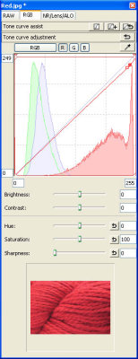
Then, use the RGB histogram when shooting -- this will give you the visual representation of when a color is clipping -- when it is up against the edge of the histogram it is clipping, even though the tonal histogram may look just fine.
Third, you need to make a desicion: do you want to play it "safe", which would mean shooting in sRGB mode and keeping your exposure low enough to ensure that your RGB histogram colors are all in range (the histogram adapts to the color mode), or do you want to "push it" a bit, meaning that you set your camera to aRGB mode -- the RGB histogram will adapt to the wider gamut and then it will be up to you to deal with that in post processing.
There are pros and cons to each approach: the "play it safe" option could give you the best results as long as the overall image has a good exposure or if you needed to brighten it up a bit you have your software set to sRGB and ensure that the reds don't get out of hand. If needed, you can pull back the Red channel saturation or brightness a bit to get the best balance.
The "push it" option is for you want the best overall exposure even though the Reds (in this case) will now be edging to the edge of aRGB meaning they will be clipped in sRGB. You will need to deal with this in post-processing -- I'd suggest starting with your software in aRGB mode (you don't want to convert to sRGB until your color processing is done). Your histogram will look "fine" in aRGB mode, but you will pull the Red channel (in this case) back in saturation and/or brightness until it is more or less in line with the other colors and inside the sRGB gamut. At that point it would be save to convert the image to sRGB if you wish.
Now, a valuable tool that you can use when processing is a color-space-sensitive RGB histogram that can be switched to "proof" your image without actually converting it. For example, DPP lets you easily switch between several color spaces and histograms so you can see where the colors fall and how much you need to work on them. Adobe Camera Raw also lets you switch between aRGB and sRGB on the fly, so if you have Photoshop you can use that tool.