photo sharing and upload picture albums photo forums search pictures popular photos photography help login
Sony Forums Challenges | all galleries >> Challenge 174: Interiors (hosted by MCsaba) >> Challenge 174: Eligible > edit image
previous | next
26-JUL-2008 inframan

1st: Pool Too
inframan

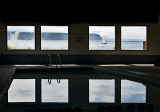
I like the way the floats at the bottom of the frame make this look like a theater.

Sony DSC-R1
1/500s f/6.3 at 26.7mm iso160 hide exif
Full EXIF Info
Date/Time26-Jul-2008 17:53:13
MakeSony
ModelDSC-R1
Flash UsedNo
Focal Length26.7 mm
Exposure Time1/500 sec
Aperturef/6.3
ISO Equivalent160
Exposure Bias
White Balance
Metering Modecenter weighted (2)
JPEG Quality
Exposure Programaperture priority (3)
Focus Distance

other sizes: small medium original auto
previous | next
comment | share
mlynn 04-Aug-2008 02:32
Nicely done, and what a gorgeous view. --Melanie
mschf 02-Aug-2008 14:51
I had the same reaction when first seeing this one, thinking the objects at the bottom were heads in a theater. Not sure which version of this I like better, maybe this one just a bit because I like 2-dimensional type perspectives, but the impression I get from either is the same. Cool shot! :)
Franky2005 02-Aug-2008 07:54
Intriguing shot! Love the perspective and the boat is the icing on top. The set up could also be interesting for some hdr, though the result would be completely different.
Ann Chaikin28-Jul-2008 07:37
Very interesting to me. I love the sailboat. Makes me feel like the outside world is creeping inside, like the surface of the sailing sea is in the pool as well. Nifty.
Ann
inframan 27-Jul-2008 19:54
I cloned out the stripe, thanks for pointing it out. Personally I prefer the ominousness suggested by the dark space over the windows over simple symmetry so didn't crop that part out.

Part of the problem I have with handling the light in this ( & similar) image is that PBase changes the tonal values on me & highlights the wall more than my actual PS version. :(
Sony Forums Challenges27-Jul-2008 18:05
I prefer this version: I think the symmetry has a much greater impact than the perspective view. A great find and capture. The simple forms give a very strong appearance. The signs of the "outside" is a perfect touch in the closed space. I would consider to crop out the stripe from the top, it would make the symmetry stronger and it does not take away anything from the picture Cheers, MCsaba