


|
|
|
|
|
|
| stevephoto | profile | all galleries >> Proofs >> My Workflow Tutorial | tree view | thumbnails | slideshow |
Here is a quick look at the workflow I use to process images for the web.
Step 1: Open the image.
If the image is a CR2 file (raw image) the Open Raw dialog box automatically appears. This is the best place for making color corrections. Say the camera white balance was set for sunlight and the image was taken under florescent lights. This is the place to fix that. If you always use raw mode, you can always correct the white balance. This is where I correct for overexposure. This is not always possible but a one to two stop overexposure is usually correctable. Photoshop cannot correct overexposure. You can also correct underexposure here but I usually do that in Photoshop.
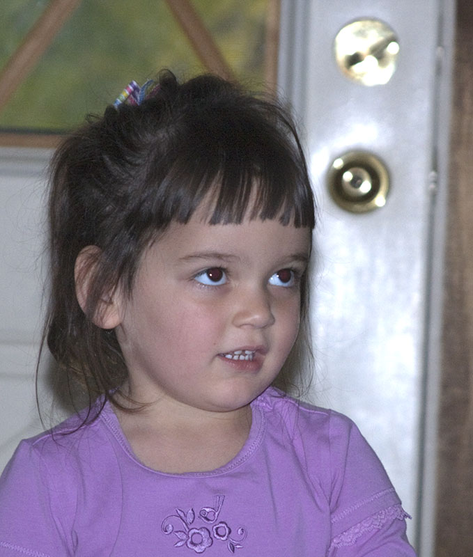
I'm starting with a shot I took of one of my granddaughters. This is the shot as opened in Photoshop. You see it's a little underexposed. I tend to underexpose a little just to keep from blowing out the highlights. We will fix this later.

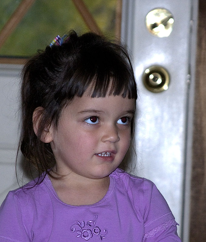
Step 2: Crop
You may or may not need to filter noise. I usually don't since today's cameras have very low noise levels. If I need to filter noise I do it before cropping. The need to filter noise is mostly an artistic decision and as such is very subjective so I'm not going to discuss it.
Cropping is an artistic decision too. I've come to trust my instincts when cropping. I think the only way to learn how to crop is to crop many, many images. Then you'll learn what you like and it becomes easy. There are some rules of thumb like dividing the image into thirds, top to bottom, side to side, and placing your subject on one of these lines. It's a place to start but every image is unique and the best crop for the image is also unique.

Step 3: Levels
Next I run Levels. This lets you adjust the range of brightness of the pixels. Read the help text about Levels for a full explanation of how to use the function. First I adjust the Highlights making sure not to blow out anything that�s important to the image. In this image I let the lock on the door get blown out but stopped just before blowing out the whites of her eyes.
Then I adjust the shadows. This is where the image starts to have some pop. The colors seem to get more saturated and the image can take on a real 3D appearance. I don't have any rules for this adjustment. Just season to taste. This adjustment can be very exciting. You see the image start to come alive.

Sometimes the midtones need adjusting. Especially if the image was taken on an overcast day or the light was very flat for some reason. This also is a season to taste case. I find I very rarely adjust midtones.
Step 4: Resize
Now I resize the image. Since this image is going to be displayed on the web I keep it fairly small. For my website (www.pbase.com/stevephoto) I set the max dimension at 800 pixels and the resolution to 72 pixels/inch. This just happens to provide for the best viewing on the website. For Facebook I set the max dimension to 450 pixels and the resolution to 72 pixels/inch. I picked this value as one that provides for decent viewing but is small enough to not be useable in prints and enlargements. This is to try to prevent photo pirates from using my images for their own gain. You won't see hardly any change in the image when it's resized. It may seem to be a little softer.
Step 5: Sharpen
Resizing an image reduces its sharpness. Also the anti-aliasing filter in front of the camera's sensor makes the image a little soft. Apply the unsharp mask. If you have a newer version of Photoshop, apply smart sharpen. The two functions are essentially the same. Smart Sharpen has a few more bells and whistles. You can read the help for the functions to get details. For web images I start with a radius of 0.5 pixels and an amount of 100%. I then adjust the amount to taste which usually means reducing it. If the image is very slightly out of focus, you may find yourself setting the amount up to 300-500%. That's okay. Just watch out for over sharpening. Over sharpening appears as a very slight halo around objects in the image. Now the image should really have some pop.
Step 6: Convert color profile
Web browsers assume all images they display use the "sRGB IEC61966-2.1" color profile. If your image uses a different profile, the colors will look slightly different when the web browser displays it. Convert the image's color profile to "sRGB IEC61966-2.1". Color Profiles can be 'Assigned' or 'Converted'. Make sure you 'Convert' the color profile.

Step 7: Convert to 8 bits and save as a JPEG.
Up to this point Photoshop has used 16 bits for each of the three color components (red, green, blue). I now change the mode to 8 bits per color component so that we can save it as a JPEG image. I then save the image as JPEG with a quality level of 8.
And we are done.
Notes:
The steps can be done in just about any order except for sharpening. Sharpening must wait until after the image is resized. Resizing pretty much undoes sharpening. Also, I don't convert to 8 bits until the very end just to give me the most flexibility in making adjustments.
If I want to make any modifications like removing an imperfection, I do that between steps 3 and 4. In doing this I sometimes add layers. I then flatten the image before proceeding with step 4.
The workflow I use to prepare an image for printing is pretty much the same with the following exceptions:
When resizing I uncheck the resample box in the resize dialog box and set the size by the number of inches rather than number of pixels.
During sharpening I set the radius to 1.2 pixels.
If I add any layers, I don't flatten the image before saving and I save it before sharpening. When I print the image, I flatten it and then sharpen it but I don't save this version. I suppose you could if you save it with a different name so as not to overwrite the first PSD file.
I don't do steps 6 or 7.
| comment | share |