


|
|
|
|
|
|
| |
| 08-JUL-2006 | Stephanie Seto |
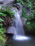
You might notice that in this photo of the waterfall taken with the Chome Color setting, the water takes on a bluish tint. The same thing happened when I ran this photo, which was taken with Normal Color, through Automatic Saturation Enhancement in Paint Shop Pro. So, for the version you see here, I used the Normal Color photo and saturated the greens only, which leaves the water looking natural but gives more oomph to the foliage.
| comment | |