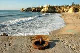
Hummm... this one smells like Portugal to me...
I like how the rusty colour of the iron ring matches the colours of the clifs in the distance... it's almost pointing us to look there!! And well I like it central like it is, because it takes our eyes into the edge of the image, so to me it's perfect and quite effective actually. Loved the angle!!
A very good idea, but the ring is too central, there is no tension in the image. Using the rule of thirds, moving the ring to the left of the image and maybe a later time in the day for a more dramatic shadow, and better light colour(you could post process to a more yellow end of the spectrum, would work better. I have posted a modified version herehttp://www.pbase.com/shangheye/failures, as an example, though you have to work to your taste. Let me know when you have viewed it so that I can remove it.
Commenting on this page requires full PBase membership.
Please login or register.


Please login or register.