


|
|
|
|
|
|
| |
| Member No. 40 | |
Judges Comments:
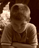
The choice of monochrome is a good one for this image. Leaving out the colour allows the subject to shine through. There is need for improvement. The image is not sharp where is needs to be: on the face and particularly the eyes. It is a fact that the human eye is drawn to the lightest area in an image so, secondly, the large hightlight on the left hand side needs to be burnt in - to match the dark area on the right? Finally, apart from sharpening the eye area you can also lighten the whites of the eyes - following on from the above comment - this will further draw the viewer to the face of the subject.
All images Copyright of the Authors