photo sharing and upload picture albums photo forums search pictures popular photos photography help login
Phil Douglis | all galleries >> Galleries >> Gallery Forty-Three: When doors, arches and gates express ideas > Ambiguous gates, El Jadida, Morocco, 2006
previous | next
09-DEC-2006

Ambiguous gates, El Jadida, Morocco, 2006

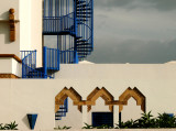
This hotel complex on the Atlantic Ocean at El Jadida uses cubistic design to establish its style and tone. While the blue exterior staircase is architecturally striking, I was particularly attracted to the stylized arched gates at the bottom of the frame. They seem to be asking the viewer to guess how much “gate” is really there? Can we walk through them? And if so, how far can we go until we hit a wall? Using the three dimensional perception of our own eyes, such questions are easier to answer. But the eye of the camera is two dimensional, and this image alters our perception enough to make the gates look fascinatingly ambiguous.

Leica V-Lux 1
1/1000s f/8.0 at 25.6mm iso100 full exif

other sizes: small medium large original auto
share
Phil Douglis12-Jan-2007 22:45
And that's because it continues to rise to infinity beyond the top edge. This is a good example of the power of frame -- that edge can imply meanng by suggesting what might lie beyond it.
JSWaters12-Jan-2007 20:15
I can't shake the image of these gates being the passage to the stairway to Heaven.
Jenene
Phil Douglis12-Jan-2007 18:55
Thanks, Tim -- I wanted to show both the new and old side of Morocco. This building certainly represents the new.
Tim May12-Jan-2007 18:13
After so many images of historic architecture it is a delight to see the themes brought into the present.
Phil Douglis12-Jan-2007 17:51
Cecii -- the sky is not leaden. It is just deliberately underexposed to make the walls "pop," as you say. It was a tricky picture to make -- There was an ugly fence at the base of the frame, separating the hotel from the parking lot in which was standing. The fence had irrelevant signs on it, etc, and had to be avoided. I include only the top edge of that fence, and use, as you note, the greenery to soften the bottom. And you are right about the empty mood -- it creates an incongruous counterpoint to the lavish architecture.

Thanks, Shirley, for likening this picture to a maze. It's an optical maze.
Shirley Wang12-Jan-2007 14:09
Very intriguing maze with beauty all over.
Guest 12-Jan-2007 07:19
An exercise in illustrative geometry and texture, light and shadow. What a lovely, refreshing image, clean and almost simple, but yet with touches of elegant inlay and design. I love the horizontals and verticals, the leaden sky making the white walls "pop,", and the softening foliage at the bottom -- and, yes, the colors and empty mood of this picture.
Type your message and click Add Comment
It is best to login or register first but you may post as a guest.
Enter an optional name and contact email address. Name
Name Email
help private comment