photo sharing and upload picture albums photo forums search pictures popular photos photography help login
Phil Douglis | all galleries >> Galleries >> Gallery Nine: Composition -- putting it together > Historical character, Bruges, Belgium, 2005
previous | next
12-JUN-2005

Historical character, Bruges, Belgium, 2005

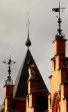
It is the quaint ornamental detail such as this that gives historical character to the architecture of Bruges. Instead of photographing a whole building or group of buildings, I used a medium telephoto lens to reach out and bring these symbolic embellishments together in a coherent, expressive way. I narrowed my composition down to three rectangular posts and one triangular spire, supporting four characteristic details -- two weathervanes, an ornamental sculpture and a heraldic beast. The morning light created strong contrasts and deep shadows. I chose a vertical format to extend the height of these embellishments as much as possible. My decision to place the heraldic beast within the triangular spire behind it was an important one. It gives this image a consistent diagonal flow of movement beginning in the lower left hand corner and carrying the eye through to the upper right hand corner. The image gradually soars upwards with whimsy, grace, and elegance, a study in historical character, expressed largely through detail.

Panasonic Lumix DMC-FZ20
1/500s f/5.2 at 37.3mm iso80 full exif

other sizes: small medium large original auto
share
Phil Douglis25-Sep-2005 23:21
Thanks, Rod. I deliberately composed the image as a series of geometrical shapes and used the beast as non-geometrical historical context. If I had placed the beast against the sky, the beast would have become the subject and the buildings the context -- a quite different image. Again, it is not a matter of judgement here. Such placement is not right or wrong, good or bad. It is a matter of my intentions. As for making the beast more visible, that, too, is a matter of intention. I wanted it be enclosed, a little historical surprise. I did not want it to stand out.
Guest 25-Sep-2005 20:54
I see what you mean about the placement of the beast, but he seems a little lost (as his and the background colors are very similar). I wonder if it would have been better to compose from a point of view more to your left, so the beast would have been against the sky, to the right of the spire. Or, leaving the composition as it is, and convert to bw with a red filter (which would definitely make the beast then stand out from the spire's background).
Type your message and click Add Comment
It is best to login or register first but you may post as a guest.
Enter an optional name and contact email address. Name
Name Email
help private comment