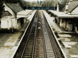
Thanks for taking the time to comment... the bridge is actually blue, but I've toned it down and given a bit of sepia all over.
Guest
21-Feb-2007 17:50
Really like this one. Even though the waiting subject is even smaller than in the "waiting" shot, this is a much more pleasant photo to explore and find him.
Perspective is simple but very effective.
Love the color/tone you chose - nice repeating patterns throughout.
Very cool look.
I'm curious - the bridge looks a bit blue (comparatively). Was this intentional or just the result of a globally applied effect?
This would also work well cropped almost to the bottom of the buildings - sort of a pano look - might not be better, just different.
Bob