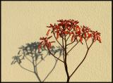
I agree - this is a great image. Frankly, at first, I didn't like it, but it grew on me.
I also agree with Bob that you might find that perfect time to reshoot this, and the next time, stop it down as much as possible so as to keep all the shadow in focis. However - I rather like the textured background.
Does anybody think the image could use just a bit more color saturation to bring up the red a little more?
cbses
16-Mar-2006 23:41
Very cool, very simple, nice Japanese feel - I like this a lot. I guess it's not quite negative space, but what's not there is as important as what is.
My only quibble would be that the focus/sharpness falls off on the left. I think I might prefer a more uniform backgound to keep the image as simple as possible.
Nicely done.
Bob