photo sharing and upload picture albums photo forums search pictures popular photos photography help login
Konica Minolta Users | all galleries >> KM Challenges >> KM C42 Architecture: Hosted by JeffryZ >> C42 Architecture: Competition > ++"Come, sit awhile..." by Veronica
previous | next
12-SEP-2005

++"Come, sit awhile..." by Veronica

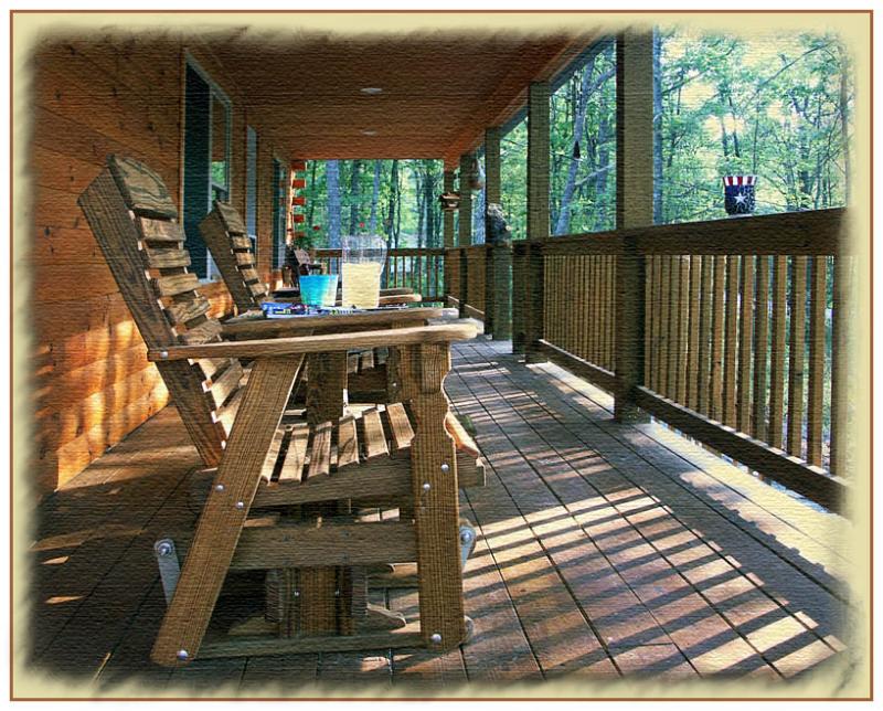
Long shadows of a late summer day create contrasts in light and shadow. This is my porch & I invite you over for a nice lemonade.

Minolta DiMAGE A1
1/60s f/2.8 at 8.3mm iso100 full exif

other sizes: small medium large original auto
comment | share
Guest 17-Sep-2005 08:22
So much better now. The low perspective 'ossaciates with sitting down' and focuses on the long shadows. The lemonade is also placed perfectly. I have my doubts on the 'paintery texture' filter that is applied here. But it certainly looks very good !

Alain
cbses 14-Sep-2005 09:19
Oops - I see you did add you PP steps in the link - thanks for sharing.
Bob
cbses 14-Sep-2005 09:16
WOW - What a difference. This is great - 100% better. Framing works very well as does the new texture. You'll have to share your technique.
Bob
cbses 13-Sep-2005 23:46
I think MC has some good suggestion - clipping off some of the roof makes it appear more open and out-doorsy, as would having a bit more of the chair visible.
One other thing - brought to mind by your MTF focal point tutorial posting :) - there are nice structural lines of perspective that draw you to the focal point, but there's nothing there. Could be that I am misintrepreting something (one of my favorite hobbies).
In any event, count me in for the lemonade.
Bob
Konica Minolta Users13-Sep-2005 10:50
A realy inviting picture, Veronica: the warm tomes of the porch, opposited to the cold outside suggest the call to enter and sit down for a while, the contrast in the colors is very effective. I have few recommendations: the shadow play is really nice, and you can make it more dominant in the picture by cropping from the top (the ceiling). The red bottle on the middle of the barrier is quite dominant due to its greenish background, and distracts a bit from the main elements. I think the picture would be better without it. And perhapst I would try to add more space in the foreground by including the whole chair. This would strengthen the invitation message of the empty chairs, and increase the effect of the shadows of the barrier. I would also consider to replace the "cold" objects in the porch (e.g. newspaper) to "warm" ones to increase the contrast between in and out. MCsaba