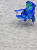
I like the placement just fine, but the green flowers somehow take away from the blueness and loneliness seemingly intended by the image. Nice idea.
Guest
04-Jul-2005 08:44
I like this one too Jeffry. I'd also initially thought that the placement is maybe too far into the corner, but on reflection I think it's fine. The green adds some interest, but I also wonder whether a plain blue chair might not have been a stronger impact for the theme. It would also have been interesting to do more with the footprints, which I suspect you didn't think about at the time. They could lead anywhere and I think they would have worked well leading to/from the lower left corner to complete the diagonal through the chair.
John
I like this picture very much, the "blue" express itself well from the homogeneous backround. Perhapst I would place the subject just a bit lower and to the left (but still in the upper right corner). - MCsaba