photo sharing and upload picture albums photo forums search pictures popular photos photography help login
Konica Minolta Users | all galleries >> KM Challenges >> #6: Tracks - hosted by Paul d'Aubioul >> #6: Tracks - Exhibition > Millennium Force by Mike Livorsi
previous | next
30-MAY-2003

Millennium Force by Mike Livorsi

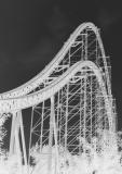
The original had dull grey skies and poor color. However, while I was trying to clean this up, I accidently selected negative. And, I thought it looked much more interesting.


other sizes: small medium original auto
comment | share
niamh 18-Apr-2004 13:30
Personally I am not sure whether I like the "negative" treatment, but it's effective at emphasising the structure and isolating it within the frame. The curves fill the frame well.
Claudio Gatti18-Apr-2004 03:23
Interesting effect... you dfientely "rescued" the image, if the lighting and color were not rigt. I've used use myself BW for the same purpose quite a few times. Good idea for the theme, and the treatment gives it a very graphical feeling.

Claudio