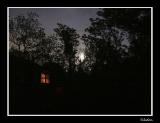
I echo all the comments below about color and theme...very nice. I do feel the window is a bit too high and a little too much negative space at the bottom. Cropping the bottom 1/6 or 1/8 away may make the image more "settled". Perhaps...maybe. Anyway, a great picture in any case.
Guest
04-Mar-2004 08:44
No, may be no - that will move the center. Strange, it's different when viewing the fill-sized pic and the thumbnail...
Guest
04-Mar-2004 08:43
Good!
What about cropping it from right down - just a little? 5-10% from right and 3-5% at bottom may be.
Good theme idea. Nice effect with the dual lighting. I like it.
niamh
03-Mar-2004 14:12
Hi Jack - I didn't fully appreciate your idea for this shot until I looked at it full size! A nice, simple composition but I think it works really well, with the warm colours inside the window contrasting with the gathering dark. I'd be interested to know what post-processing (if any) you had to do to get this spot-on.
niamh.