Soft proofing your images before having them printed is a great way to simulate how they will appear based on the specific printer and paper combination that will be used.
This is required because monitor display and printed output never match perfectly. Generally speaking, printed images are characterized by somewhat reduced colour saturation (i.e. their "colour gamut" is narrower) and lower contrast (i.e. their Dmax is lower) with respect to what a good monitor can display.
First of all, obtain and install the correct ICC profile for your chosen printer and paper stock. Ready-made ICC profiles can often be downloaded from most printer and paper manufacturers' web sites, and/or may be supplied by the PhotoLab you use.
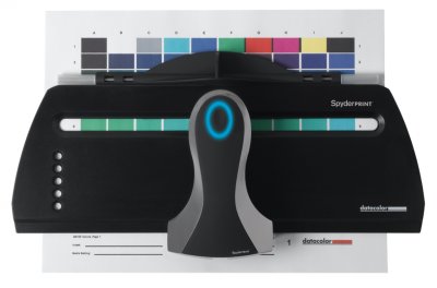
Alternatively, for improved accuracy, you may generate your own ICC profile for your specific printer and paper, but in order to do so you will need specific software and a measurement device, e.g., Colorvision Spyder Print.
In most image editing software, the soft proofing dialogue box has the following options (see provided screenshot below):
Device to simulate
Select the appropriate ICC profile for your printer and paper here.
Preserve RGB Numbers
This must always be OFF. (When ON, it would show you what the image would look like if you just sent it to the device whose profile you chose without doing any of the necessary conversions that are taken care of by the print driver or RIP)
Rendering Intent
The useful alternatives here are Relative colorimetric, Saturation and Perceptual
Relative colorimetric leaves in-gamut colours (those that can be faithfully reproduced using the chosen printer and paper) alone, and just re-maps out-of-gamut ones.
It tends to work well for wide-gamut and high-Dmax papers.
Saturation remaps highly saturated out-of-gamut colours to prioritise maintaining a visually similar high level of saturation within the printable colour space (this comes at the expense of hue and luminosoty fidelity, though).
It may be a good option for some images containing bright highlights (e.g., sunsets and city scenes at night with artificial lights), when printed on wide-gamut and high-Dmax papers.
Perceptual tends to reduce saturation in all hues. This does a good job of smoothly and progressively desaturating colours to fit the output gamut, but it may also unnecessarily desaturate some of the hues which were already in gamut to begin with.
It tends to work well for narrow-gamut and low-Dmax papers.
Black Point Compensation (BPC)
This is generally best left ON, and is meant to gradually adapt the darkest tones of an image so that detail can still be resolved in the print, rather than clipped to black.
The only instance when a closer match is reached by setting BPC to OFF is when images are printed using some RIPs that do not support BPC (which however will result in more clipped shadows).
Display Options (On-Screen) (these should both be checked or unchecked together)
When both Simulate Paper Color and Simulate Black Ink are unchecked, the paper white is mapped to your monitor's white, and the printer's black is mapped to your monitor's black.
If you're printing to a very bright and glossy stock (e.g. glossy C-prints), this view is fairly accurate. But if you're printing to a lower-Dmax paper (e.g. Inkjet prints on matte paper), it will give you an overly optimistic view.
With the Simulate Paper Color and Simulate Black Ink check boxes on, Photoshop attempts to simulate the true black density of the ink and the white of the actual paper being used, instead of using the darkest black and the brightest white the actual display is capable of producing.
If you look at the image while turning on Simulate Paper Color, the effect appears dramatic, but much of that is actually optical illusion (our eyes need time to adapt).
Try looking away from the monitor when you turn it on, then wait a few seconds before looking at the image to allow your eyes to adapt to the new white point.
A second trick is to view the image in full-screen view with the menu bar and the palettes hidden. That way, you ensure that the paper white is the brightest thing on the screen, and your eyes have a chance to adapt to it as the true white (if you have brighter white user interface elements appearing on screen, the paper white will seem visibly dim and tinted in comparison).
To sum up, my recommended soft proofing settings are:
- Preserve RGB colors: OFF - Rendering Intent: Relative colorimetric or Saturation (for C-prints and Inkjet/Giclée prints on coated, glossy papers) / Perceptual (for Inkjet/Giclée prints on uncoated or matte papers, HP Indigo prints and Print-On-Demand books) - Black Point Compensation: ON - Simulate Paper Color: OFF (for C-prints) / ON (for all other prints) - Simulate Black Ink: OFF (for C-prints) / ON (for all other prints)