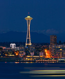
i like the strong orange colour of the arterial, it goes well with the dark blue, mountains and clouds in background give a nice sense of scale. for the sake of criticism, blurry lights always look cool, although i am unsure if the ferry works in this piece. it disctracts my eye from the space needle which is the crux of the piece, by being focused off to the side of the piece without adding much interest. i would rather have the ferry be blurred but still identifiable as such, as to create an attidional identifiable subject to balance the space needle; or have the lights going across the whole scene, which would add colour but appear as a distracting burt of light off in the corner.