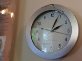
Lyle,Prefer the coloured version, the image is not so bright, the reflections in the clock
clearly define the window.
The subtle shading around the clock give it a greater depth.
Also good but I guess we might both prefer the monochrome one. I like the way you have balanced the glimpse of board and accompanying highlights with the clock. Great.