photo sharing and upload picture albums photo forums search pictures popular photos photography help login
JW | all galleries >> 2004_to_2020 >> Galleries By Subject >> Monochrome > 20060209 Water, Light & Darkness
previous | next
09-FEB-2006

20060209 Water, Light & Darkness

The February B&W PAD challenge started by Gary Winters - http://www.pbase.com/digitalgee/feb2006 - is really making me think about my photography.

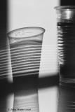
Yesterday's picture was born to be a colour picture - flat contrast, little or no texture yet really strong colours which shouldn't be hidden. Whereas, this one didn't really need the desaturation. It had no colour but it does have light, shapes and texture. So doesn't this make it a 'natural born' B&W image.

Is it not reasonable to say that images are either naturally B&W or naturally Colour, and that as photographers we shouldn't be afraid to go with the flow - accepting a mix of work depending on what serendipity throws our way?

Any thoughts?


other sizes: small medium large original auto
comment | share
Guest 15-Feb-2006 04:34
Definitely born for B&W - it works really well.
David Clunas12-Feb-2006 14:25
Like the mix here, some great lines and light on that beaker
Bob Floyd10-Feb-2006 16:50
John, great image. I really like the simplicity here. This is a well thought out and executed photo.

As for your question, I am not sure I agree. I like what Gary says below about color and it being the subject. That is the only time I think it is absolutely necessary, when it is the subject in and of itself. I would also disagree about your assessment of the image from yesterday. I thought it a strong image in B&W (of course, I say that not having seen the color version either so I could change my mind). The lines and various gradients made it interesting to me.

This is going to sound elitist but I know when I am shooting specifically for B&W I think more about the "art" of the photograph. Not because it is harder to shoot B&W but rather because I consider it more artist than color.
Guest 10-Feb-2006 12:36
Interesting comment from Gary. I think most of what we think of as composition is line and form. Texture and colour “usually” are more a part of the subject matter. Perhaps this is why people struggle with a lot of modern art, as the art is less about composition and more about the subject - i.e. itself.

I agree that we should go along with the flow and choose the right medium for the right subject. I guess in taking up the B&W challenge a significant part of that challenge is finding the most appropriate subject. This one is ideal by the way - great composition.
Gary Winters10-Feb-2006 06:37
Interesting question. I've been thinking about it as well this month. I suppose some images must be told in color, because the color is the subject or part of the subject. When I start thinking in black and white, I know I'm more conscious of my composition, and of the range and play of light, because I now realize that all too often I use color as a crutch, a way of compensating for deficiencies in the composition. I don't think you can "cheat" as easily in black and white. If the image doesn't tell a story, it REALLY fails in black and white.

OTOH, I find it hard to take black and whites of flowers. I did a harbor scene which came out okay, but otherwise, I'm having trouble with nature shots. (Ansel Adams is rolling over in his grave now.). for me, black and white is all too often about metal, and stone, and buildings, and man-made stuff.

I'm rambling. I'll hush up now.
Guest 10-Feb-2006 02:51
Very nice, and very well thought
Karen Leaf10-Feb-2006 01:26
I keep looking at all the lines. Vert and hori and angled. It wouldn't work in distracting color.
I would think we'd take what's thrown at us. Some are better catchers than others. You are a golden glove.
laine8209-Feb-2006 23:10
A good shot of refracted light. I agree with Joanteno, the b/w challenge stretches your imagination to help obtain clear defined tones. This has many pleasing visual aspects,John. GMV
joanteno09-Feb-2006 22:28
Works.. Doing B and W exercises your vision in new directions. Nice shot!
nordic09-Feb-2006 22:10
Very, very strong imagery, excellent!
Zak09-Feb-2006 22:09
Great shot!
Ray :)09-Feb-2006 21:30
John: I think this is a classic image to respond to people who run out of ideas on PAD, although I don't hear that so often now, I'm sure there are those that struggle in this way. Most people have, or can obtain a beaker and some water. All they have to do is watch where the sun goes at a certain time of day.
As for your question, I always think strong shape and line cry out for PAD, but there are many instances when that is combined with good colour too. I suppose a pretty girl is a good example here, but the monochrome will always amplify a darker mood. V.
Guest 09-Feb-2006 20:03
OOOOPS Bob Floyd not Bob Flood. I was close though!
Guest 09-Feb-2006 19:47
Oh yeah! this is a b/w and so well done too. It has fine grain to it and includes the darkest blacks and whitest whites which Bob Flood says should be contained in a b/w. There are some nice gradients throughout various parts of this pleasing image. I love the shadow containing the bending light which has passed through the water.

I'm not sure that all images can be categorized as either/or. I have seen some that can be viewed both ways, and some that shout out either color or b/w. Most importantly, does it say what the photographer indended it to.

Vote