The question of "what color-space should be used for rendering images" comes up all the time. Well, in my opinion the correct choice is dependent on the gamut of colors associated with the each specific scene. I can't make the choice for you but some of my thoughts are scattered throughout in the form of commentary and might give you an idea of what to think about. Bottom line, I typically use the sRGB color-space for rendering/editing scenes shot in the Southwestern United States.
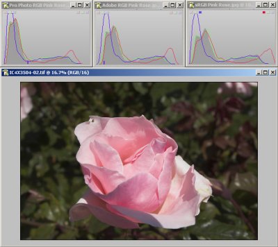
"Most" southwestern landscape scenes fit easily into the sRGB gamut; therefore, this is a good color-space choice to (1) optimize use of available resolution and (2) wind up with a rendering that prints nicely on Epson printers (to name one). Exceptions to my landscape "rule of thumb" include a few scenes that comprise flowers with bright, highly saturated colors.
If there are bright highly saturated colors the "right" color-space choice might be to Pro Photo RGB (unfortunately this gamut exceeds that of any printer I'm aware of). If you use Pro Photo RGB you can get a heads-up on colors that won't print accurately using Photoshop's proofing capability (but this requires an extra step). If you are not going to print a picture but want somebody else (using a wide-gamut calibrated monitor) to see exactly what you are seeing (using a wide-gamut calibrated monitor) then Pro Photo RGB is the "can't miss" color-space of choice; personally, I don't see this "monitors only world" as a practical situation for most folks it but might be very important to some.
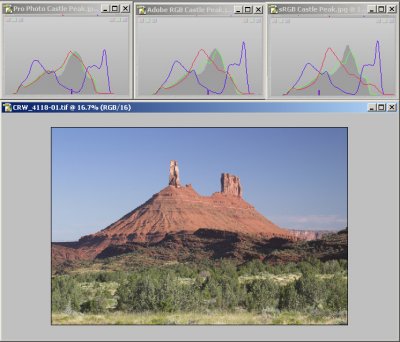
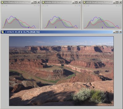
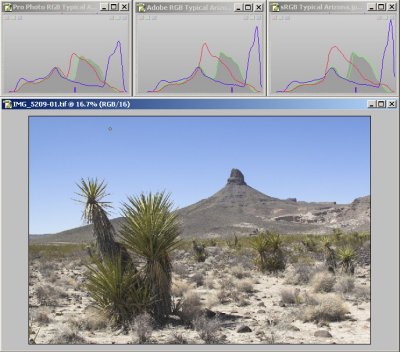
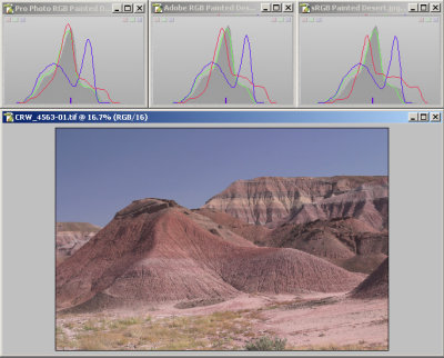
This gallery contains images of five scenes of varying contrast, color content, and saturation; they were rendered using RSP (RAW Shooter Premium) with all adjustments, including Exposure Compensation, set to their default values. Associated with each picture are channel histograms to show what you might expect depending on the color-space chosen for the final rendering (sRGB, Adobe RGB, or Pro Photo RGB). Hopefully this information will reveal a some of the subtleties associated with various color-spaces that you might want to think about as you choose. For what it is worth, if you click on the thumbnail, each of the five scenes has limited commentary regarding what I think are important considerations (your mileage may vary). The "Pink Rose" image has the most commentary and you might find the read somewhat interesting.