photo sharing and upload picture albums photo forums search pictures popular photos photography help login
Sony Forums Challenges | all galleries >> Challenge 139: Light (hosted by Jerry Curtis) >> Challenge 139: Eligible > edit image
previous | next
11-MAR-2007 Franky2005

2nd Place
Waiting for the Light*
by Franky2005

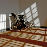
This is hard for me to decide which version works best. I think can continue to work out more than 5 versions and still would not be sure which suits the scene best. Your advice is highly appreciated. The color version is in the eligible, the original in the demo. :-)

Sony DSC-V3
1/400s f/5.6 at 7.0mm iso100 full exif

other sizes: small medium original auto
comment | share
mlynn 20-Mar-2007 00:43
Love the subject and composition, lovely light. --Melanie
Helen Betts17-Mar-2007 19:20
Great capture of light and shadows, Frank. Very effective compositon as well. Helen
Franky2005 14-Mar-2007 22:28
Thank you all for your feedback and helpful comments. Finally I did a rework of the color version which you can see above. I don't really know what's wrong with me. Normally I would go for b/w, but with this image I stick with the color. ;-) Also I like Matrin's b/w version in the demo very much.
Katherine Stanback's Photos14-Mar-2007 22:02
Great capture of the light and shadows! I like this version better than the monochrome one - I like the crop and softer look. I also like Martin's version a lot.
Martin Polanic 13-Mar-2007 03:47
Excellent work, Frank! Hard to decide which version works better since both have individual things going for them! I guess when it comes to a topic like 'light', color vs. b&w really isn't all that relevant unless you're going for heavy starkness. Hmmm, it could be done with this image too, if you don't mind I'd like to give this one a play, if anything comes from it I'll place it in demos. Either way, it's a fantastic shot! ;)
Jerry Curtis12-Mar-2007 22:04
Fabulous light and light patterns, Franky. What a perfect example of the theme! Exactly what I was suggesting.

I'm a bit ambivalent about the reds... they do dominate a little, but I don't exactly find them unattractive.
Guest 12-Mar-2007 19:19
Great composition and lighting. The patterns the light casts are very interesting. However, I find the colour in this version quite unappealing. The reds are too harsh and the chairs have ended up looking muddied and blurry. I much prefer the B/W version.
Karen 12-Mar-2007 00:36
A great picture for this theme! When viewing the thumbnail size picture, it is like an optical illusion, as it appears that the image is not square although I'm sure it is. I guess my eyes are trying to make the thicker shadow be the bottom edge. I don't see this in the larger image as the bottom is parallel to the bottom of my screen. But it ought to have the effect of drawing viewers in!