photo sharing and upload picture albums photo forums search pictures popular photos photography help login
Type your message and click Add Comment
It is best to login or register first but you may post as a guest.
Enter an optional name and contact email address. Name
Name Email
help private comment
Phil Douglis | all galleries >> Galleries >> Gallery Twelve: Using color to express ideas > At the port, Essaouira, Morocco, 2006
previous | next
11-DEC-2006

At the port, Essaouira, Morocco, 2006

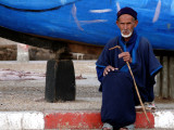
The blue garments on this man match the old boat behind him. Blue is the prevailing color in Essaouira's harbor. I will often look for subjects that will either complement or contrast with the colors in the background. In this case I found chromatic harmony, rather than dissonance.

Leica V-Lux 1
1/80s f/3.7 at 88.8mm iso100 full exif

other sizes: small medium large original auto
share
Phil Douglis28-Feb-2007 06:29
Welcome to my galleries, Townley. Glad you appreciate how this was put together on the basis of color, and hope you can apply it to your own work.
Guest 28-Feb-2007 04:27
Wonderful shot! Excellent composition
Phil Douglis26-Feb-2007 23:14
Thanks, Yiannis, for appreciating this image, both as expression, and as an example of an image based on a particular color.
Phil Douglis26-Feb-2007 20:39
Thanks, Zane, for playing with this image in terms of its colors. Once again, I do not see your versions as any "better" or "worse" than my own -- only different. Which is what expression is all about.
Yiannis Pavlis21-Feb-2007 03:55
Great shot and magnificent presentation.
Zane Paxton18-Feb-2007 21:33
Hmmmm... I agree with everything you said up to the point of “…I found chromatic harmony, rather than dissonance”. Engaging into the rich cultural traditions of their use of color is wonderful, but that doesn’t relieve or override the importance of using color well to support the intent of the composition.

What I find unsettling about this otherwise fine image is that what stands out as dissonance; which is the counterpoint here which is the red concrete curb.

What I want to experience is the terrific color play between the man’s exposed skin and the rich blue. The red (the counterpoint or exception) draws the eye very aggressively to the red curb which is not the important part of this image! My eye is dancing back and forth between wanting to study the man's face (very important) and the red that demands that I look again back at his feet and the curb. It doesn't help that his toes were cropped off as that further draws the eye to his toes/feet (cutting something off creates strong “visual tension” at that point).

Yes, the red also adds something as the counterpoint to the rich blue giving the blue more definition, but I think it would have been more successful if you had backed off more so that the red is less important and it starts be a device to draw the eye to the whole man as a visual element rather than so much towards his feet!

The whole point here is to use classic compositional means to enhance rather than distract from one’s intent (“Chromatic harmony”. One’s eye is always drawn strongly to points of brightness, contrast and strong color, so that either helps or hinders an image.

To make the point, this version enhances the powerful color play possible between the man’s skin and the rich and wonderful blues. That color play is then center stage and more emphatically aligned with your stated intent of “found chromatic harmony” with the blue giving more meaning to the rich skin tones and the rich skin tones giving more expression to the wonderful blues.

http://www.pbase.com/devonshire/image/74534969

This version give more breathing room for the red and perhaps more successfully allows the red to exist in the intended harmony by allowing the red to serve as a device to draw the eye to the (whole) man.

http://www.pbase.com/devonshire/image/74534970
Phil Douglis11-Jan-2007 18:35
What you call "color coordination stuff" speaks of local identity here. The man wears blue because it is Essaouira's color -- it is on virtually every shutter and door in the town. And the town's fishing boats are blue as well.
monique jansen11-Jan-2007 11:24
You know I love this color coordination stuff.
Type your message and click Add Comment
It is best to login or register first but you may post as a guest.
Enter an optional name and contact email address. Name
Name Email
help private comment