photo sharing and upload picture albums photo forums search pictures popular photos photography help login
Phil Douglis | all galleries >> Galleries >> Gallery Thirty Nine: Juxtaposition – compare and contrast for meaning > Medieval architecture, The Cloisters, New York City, 2006
previous | next
03-AUG-2006

Medieval architecture, The Cloisters, New York City, 2006

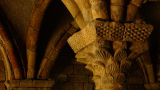
The Cloisters, holding the medieval collection of the Metropolitan Museum of Art,
is a group of European buildings that were transplanted in the 1930s to a park high over the Hudson River at the northern tip of Manhattan Island. This image shows a small part of one building – a column and the roof supports from a cloister of a French monastery. I built the image in two layers – a simple juxtaposition of foreground and background subject matter. It is also a juxtaposition of color and tonality – with light stone in the foreground contrasting to the dark ceiling overhead. I repeat the arching roof supports in both background and foreground to link the two layers.

Leica D-Lux 2
1/30s f/4.0 at 15.6mm iso200 full exif

other sizes: small medium large original auto
share
Phil Douglis22-Aug-2006 17:07
We are looking back into time here, Celia. I wanted you to feel the past, not just see it. You are feeling it with your own imagination, largely because I chose to abstract the arches as you so eloquently describe. The resulting image is a study in dimensionality, the combined result of light direction, texture, and color variation. The longer we look into the image, the more it will work on the senses and the imagination. Thank you for seeing this, Celia.
Cecilia Lim22-Aug-2006 10:35
I like that you cropped the image this way because you draw our attention to the details of the stonework, and that you only show us just enough to suggest the beautiful arches radiating upwards. The abrupt crop of the arches also create tension-there is immense potential here as you entice us with thoughts of splendid beauty bursting over our heads, thus giving much life to this inert stone. I think the subtle nuances in colour and texture of the stone that give it its character would have been lost in B&W, so retaining the image in colour makes it so much more expressive here. The golden colours also give the stone warmth, bringing its beauty to life. I alos love the soft side lighting because it gives the cloisters a very 3-dimensional feel... I can almost reach out and touch it.
Phil Douglis16-Aug-2006 21:09
You read my mind, Christine. I almost did convert this to black and white, but when I compared them, I saw the value the rich contrast of color brings to the image. That is why we always shoot in color and then convert later, if need be. And thanks, Ai Li, for using this image as a medium for studying juxtaposition and applying it to your own vision. I hope you will train your eye to see comparatively, and then stress those comparisons and contrasts by juxtaposing only those elements that best tell your story. Keep it simple, pure, and expressive.
AL16-Aug-2006 07:53
I really like how well you played with the color tone, texture and graphic element. Phil, you've so far brilliantly showed the different ways of juxtaposition. In people, in nature, in art, in architecture and in time. So many possibilities, highly visible yet often unseen. I'm keen to see and click next now...
Christine P. Newman13-Aug-2006 22:05
It was interesting to read your comment, Phil because my first reaction was - why not black and white? I got your answer.
Type your message and click Add Comment
It is best to login or register first but you may post as a guest.
Enter an optional name and contact email address. Name
Name Email
help private comment