


|
|
|
|
|
|
| |
| 21-NOV-2005 | bugzie |
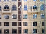
A glass wall in Federation Square, Melbourne, reflecting an adjacent Queen Anne facade.
| comment | |
| Konica Minolta Users | 23-Nov-2005 11:45 | |
| cbses | 22-Nov-2005 23:29 | |
| Konica Minolta Users | 22-Nov-2005 12:32 | |
| Konica Minolta Users | 22-Nov-2005 10:30 | |