photo sharing and upload picture albums photo forums search pictures popular photos photography help login
Phil Douglis | all galleries >> Galleries >> Gallery Five: Using the frame to define ideas > Red and Lavender, San Miguel de Allende, Mexico, 2005
previous | next
01-NOV-2005

Red and Lavender, San Miguel de Allende, Mexico, 2005

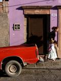
I began working on this image as a framing exercise, using the left hand edge of the image to slice the red pick-up truck in two in order to create a more incongruously abstract color clash between the red steel truck bed and the lavender building behind it. As I worked on the framing, I saw a woman and girl moving up the street towards me. I wanted until they were squeezed between the back of the truck and the right hand edge of the image and then released the shutter. The resulting photo is charged with tension, created largely by what I left out. The missing cab of the pickup truck forces our minds to imagine it. The people seem to be lunging out of the image – they are so close to the edge that we are moved to wonder what might await them beyond the right hand edge of the frame. The doorway to the lavender building is also a frame of sorts, left stunningly incomplete. It seems as if the top of that frame has been turned into a fragment of what it once had been. The image is a series of abrasions – the stucco in the upper left corner of the frame is peeling away, the front half of the parked truck is gone, its rear part needs repair, and the door frame of the house has been chopped apart. In contrast, the people seem incongruously intact. The little girl wears her best dress, presumably for school. Her book bag is even a near match for the color of the building.

Panasonic Lumix DMC-FZ30
1/500s f/6.3 at 18.8mm iso80 full exif

other sizes: small medium large original auto
share
Phil Douglis20-Jun-2006 05:07
It would have been a different image without these people, Jack. The colors would still be there, as you say, and creating a color clash with red and purple would have certainly drawn the eye of the viewer. But once you have the eye of a viewer, you owe them more than a pleasing image. You owe them meaning. I thought the mother and daughter and their shadows pinned between the car and the edge of the frame created tension and energy. It's an image about space. As Mikel points out, the space is tight, but the vivid colors imply that there is still room for some happiness here.
Guest 20-Jun-2006 02:40
Color combination wonderful! I'm sure it would have been good, even without the people.
Phil Douglis12-Nov-2005 20:13
Glad to see this image work on your mind, Mikel. Go ahead and get lost in it. I did. You are right. I put a lot of thought into this picture and I worked on it for quite a while. Thanks for adding that part about the hard life of the energetic, optimistic people who live here. The red and the lavender do imply optimism, even in the face of
the evident wear and tear here.
Guest 12-Nov-2005 18:07
If you still did not have enough of my coments ;), there is an other element that brakes with the harmony of the vertical and horizontal lines in a violent way, it is the shadow of the women shown on te door.
Guest 12-Nov-2005 18:05
There are so many elements to analize here that I am bount to get lost a bit, it is a nice image though, don't get me wrong, but I see your caption and I see that you also needed a great deal of thinking on this.
As you say, croping the image was good for two reasons at first the abstraction giving us to imagine the sorrowndings, like you say, the other important subject of it is that we get to focus easily in several elements, while with a wider angle there wold be much less interests points. First of all, my eye whent to the pik-up, I imagine that doe to the bright color. But yes, it's dusty texture gives us an idea that we are not on the wealthiest neigbourhood of the City, but on a workers neigbourhood, were even the car has to endure mooving in dusty traks or constructions. On the other hand I see the metal plated door of the building, that wold give me a deeper feeleng in the neighbourhood, insecurity, probably provoked by margination or poor living conditions. All of it is though incongruent with the purple wall, a lifely color still bright enough as to produce an other incongruity too with the left wall, the broken brick one. A last element that does pay my attention is the door number, though it doesent give me much information in the context... well, I imagine that it gives me the ultimate proove that people live in that building.
And for ending there are the women and the child walking up the hill and their stressed bodies, also give a feeleng of hard work kind.
Perhaps the overall of this images leads me to think about a popular neigbourhood were people have to work hard for a few dollars and living is not easy, but there is a spark of optimism too, the purplish collor triggers this more optimistic view that tells me that despite all, there still is space for some happiness and joy.
Type your message and click Add Comment
It is best to login or register first but you may post as a guest.
Enter an optional name and contact email address. Name
Name Email
help private comment