photo sharing and upload picture albums photo forums search pictures popular photos photography help login
Type your message and click Add Comment
It is best to login or register first but you may post as a guest.
Enter an optional name and contact email address. Name
Name Email
help private comment
Phil Douglis | all galleries >> Galleries >> Gallery Twenty Two: Black and white travel photography – making less into more > Maker of Rice Bowls, Mandalay, Myanmar, 2005
previous | next
05-FEB-2005

Maker of Rice Bowls, Mandalay, Myanmar, 2005

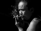
The rice bowls carried out for alms every morning by the monks of Mandalay are manufactured by hand in a small "factory" just outside the city. This is one of the workers, taking a stogie break.

This is an effective portrait in both color as well as in black and white because of the degree of abstraction created by light and shadows falling upon the subject. I wanted to express the character of this man – tough but thoughtful, confident, skilled and experienced at what he does.

In the original color version, which can be viewed in my Myanmar travel article at: http://www.worldisround.com/articles/139134/photo108.html , the rich skin tones and purple tank top add immediacy to the play of light and shadow in this image that puts him in our presence.

In this black and white version, the interplay of light and shadow alone is stressed. It brings a sense of the unknown to the picture. Each version has its merits. For sheer realism and presence, the color version is hard to beat. The black and white version stresses the mysteries of life, and his thoughtful approach to them. He becomes a universal symbol when another layer of abstraction, this time the removal of all color, is applied to the image.

Panasonic Lumix DMC-FZ20
1/500s f/4.6 at 64.5mm iso100 full exif

other sizes: small medium large original auto
share
Phil Douglis03-Jun-2007 17:16
I love your word "Machoness," Tricia. I see exactly what you mean -- he smokes his cigar in affirmation of his gender. The black and white version of this pictures enhances that aspect by neutralizing the colorful shirt he is wearing.
flowsnow03-Jun-2007 08:00
I always enjoy looking at a smooker. Not that I smoke myself but i think I imagine myself as a camera wanting to capture the intensity of the smoke coming out from the cigarette or even from the mouth. In this shot his machoness is revealed plus the frown on the forehead shows he is taking a deep breath sucking his cigeratte.
Michael Tauber18-Jan-2006 17:34
Classic picture
Phil Douglis04-Dec-2005 23:47
There is virtual unanimity here on that count, AJ. The black and white treatment takes the image far more quickly into the imagination than the color version did.
Guest 04-Dec-2005 21:22
superb B&W treatment
Phil Douglis17-Oct-2005 19:08
Thank you, Galina for sensing the human values coming at it through this image. Shrewdness, perhaps? Cunning? Thoughtful? Human values, all. Coming from a master of black and white imaging herself, I consider your comment about my use of light and shadow to be an honor. You are correct in your view that light areas look as if they have been "snatched out" from the dark shadows. Whenever I shoot a picture with strong highlights and heavy shadows, I think of how Michaelangelo once defined his approach to sculpture. He said that he felt that his figures lived entrapped in a block of marble and that it was his task to chip away the marble and release the figure from its prison. I see the darkness as my marble, and try to chip away at it by revealing the highlights within. (Interestingly enough, I recently had a chance to photograph one of Michaelangelo's sculptures, and I used this very same approach to release the figure from the darkness by stressing the highlights within. Seehttp://www.pbase.com/pnd1/image/45584548 )
Galina Stepanova17-Oct-2005 18:25
As more I look at this portrait, as more I admire the way your photographed the light, Phil. Light areas look like 'snatched out' from dark. Truly amazing mastery!
Portrait with huge human value.
Phil Douglis01-Jun-2005 17:43
Thanks, Scott, for making the points you make here. I agree with you that content is always the prime consideration when it comes to expression. As for technical considerations, I believe they are only relevant to the extent that they affect meaning, for better or for worse. I think it would be a huge mistake to evaluate technical matters in a vacuum. So the question here remains, to what extent are the eyes the key to the expression here? I originally felt that the hands and the smoke were what made this image so special. Then Ruth pointed out the effect of the worry lines on the forehead. The cigar, the hands, the worry lines are all in critical focus here. The hooded eyes are deep set and in shadow -- they are important, but to quibble over whether or not they are also in critical focus is, in my view, beside the point. Ruthie's comment about the worry lines changed the meaning of this picture for me. He is no longer just tough and thoughtful, but he now seems a bit more concerned as well. I am glad you agree.
scott 01-Jun-2005 12:39
Ruth, you said that the eyes could be hardly seen? I'm not sure about that. It maybe that my monitor was not calibrated properly but I could see the eyes quite clearly.

When I look at an image, there are two things I look for. Firstly is the content aspect, then the technical aspect. I couldn't agree more w/ any of you guys that this image is indeed full of meaning and content. However, when images are put on the internet for the purpose of helping people learn the photography, I'd like to believe that the technical aspects are quite relevant, too. When Phil placed the focus on the forehead, I'd like to know why he did that instead of placing it on the eyes. I ask questions and give my opinions w/ the purpose of learning more about a subject.

Ruth, when the focus is on the eyes, I don't think it would make it technically worse. People make judgments on photographs based on where they are coming from. You can't just outrightly say it'll make it technically worse. This is why: from where I am from, we have a saying that goes (roughly translated--Looking at a distance w/o really looking at anything). This saying is usually used to describe people who are having problems (imagine a person staring blankly out a window). This saying first popped into my mind when I saw this image. Hence, I pointed out that I think it would've been better when the focus is on the eyes.

We definitely have different points of interests when viewing a photograph. I read your comment regarding the worry lines, and looking at it from that angle, I'll have to agree w/ you.
Phil Douglis06-May-2005 23:31
You make me see my own image in a new light, Ruth. I did not see the importance of the worry lines in the forehead until you mentioned them. I saw them as symbolizing his thoughtful approach to life, while you see the forehead as the key to the entire image. When I look at it now, I see concern as well as contemplation. This guy seems to have it made -- yet perhaps he is not as confident as I originally thought. Thank you, Ruth, for your detailed analysis of this image, and for taking the focus off the focus debate and putting it on the substance, where it belongs. I am in your debt for invigorating this image.
ruthemily06-May-2005 12:23
if the focus was on the eyes, we would wonder what it is he is looking at. the image isn't about what he is looking at, because it seems to me that he is staring off into space lost in his thoughts. the fact that the focus falls on his brow only strengthens that point. it makes me see this image as the man being deeply reflexive and contemplating life, than watching something happening in front of him. the worry lines are in focus and thus become the focus/emphasis of the picture and its meaning. Scott said that it wouldn't change the meaning if the focus was shifted to the eyes, but it would make it technically better. i disagree. i think it would change the meaning substantially and it would make it technically worse. you can hardly see the eyes anyway so the whole thing would look out of focus!
i think the black and white version is 681 times more powerful than the colour one you linked to. thanks for having explained in the previous comments about why - it is because it becomes less about this man personally, and more about how we all are. he becomes a universal symbol through abstraction.
as for the cropping suggestion - i tried to hold a couple of bits of paper to my screen to see what it would look like in a vertical frame. i am glad though, that you decided to stick with your original framing, Phil. for me, the negative space is the incongruity here. he is looking out into it, but he probably actually doesn't see anything before him for being so lost in his contemplations.
Phil Douglis06-May-2005 05:09
Scott, this only shows us that different people can look at the same picture and see different meanings. I see his eyes themselves as context, not as subjects of this picture, because they are in semi-shadow due to the angle of his placement in the image. You see the eyes as having a lot to say, which they would, if not in shadow. The slight difference in sharpness is, in my view, relatively unimportant. You are more technically oriented than I am. I look for meaning first. You see that meaning here, but you are also strongly influenced by technical factors such as minor differences in focus. That's what makes photography a subjective and variable form of expression. To each his own.
scottkho 05-May-2005 06:36
Sir, on the contrary, I think, though it's true it wouldn't improve the image by leaps and bounds, the focus on the forehead won't tell us as much as when the focus was sharp on the eyes. I mean, this man's eyes have a lot to tell. Great shot, nonetheless.
Phil Douglis05-May-2005 00:23
Thanks, Scott. I like this one too -- the black and white greatly simplifies the image and brings out the ideas I want to express crisply and cleanly without distraction. The detail on the forehead is indeed is extremely detailed, but the softer areas elsewhere are, in my view perfectly capable of expressing my idea. I am never concerned about minimal focus variations, as long as the idea is well expressed. I don't think the image would be improved in terms of substance if the eyes were the focal point here -- they are deep set and in shadow.
scott 04-May-2005 06:14
Ah, this i like the most. Looking at his hands, you see a man who is used to hard manual labor. His eyes convey a sense of thoughtfulness and perhaps a feeling of security. What I don't like about the picture is that once again, the focus is a little off. Here, the focus is quite clearly around the forehead. I think it would've improved the image if the focus was on the eye.
Phil Douglis19-Apr-2005 20:07
There is nothing wrong with the link to this picture on worldisround.com, Audra. Try going to my worldisround article on Burma itself athttp://www.worldisround.com/articles/139134/index.html and you will find it there in color. Its well down in the article -- the 71st thumbnail on that page. Just click on it and you will see it larger, and if you wish, the click on a full size link to see it as large as this black and white one is.

Hope this helps.
Guest 19-Apr-2005 16:56
Hi Phil, This photo is wonderful and I wanted to see the color version as well, I am not able to see it when I click on the link. I see only a small red box, I try to open it but I do not have the option to, Do you know why this is? Regards, Audra
Phil Douglis07-Apr-2005 21:30
You are making me work overtime with your suggestions today, Alister! I have played with your suggested vertical crop, which does indeed force the smoke to ascend rather than disburse. It becomes a more intense image as well. However the horizontal frame provides a field of black into which his thoughts seem to flow. This is a much more contemplative image than your vertical suggestion would be. Neither crop is right or wrong. They are two entirely different expressions. I'll go with contemplation and let the smoke go were it may.
alibenn07-Apr-2005 14:02
Ah Phil, painting with light indeed. Wonderful interplay between light and shadow. I'm sure this would also make a terrific vertical, with roughly a third off each side, allowing the smoke to accend, rather than disperse.!!
Phil Douglis04-Apr-2005 22:33
Thanks, Ray, for responding as you have to this image. It is the black negative space here that gives this image its sense of mystery and supplies the context for his expression and gesture which, in turn, are so strongly defined by the nature of the light. You are right -- this photograph works so well because everything is working together to express its meaning.
Guest 04-Apr-2005 20:06
Marvelous expression, negative space, and lighting. Wow, Phil, this shot has everything!
Phil Douglis30-Mar-2005 20:55
Thanks, Guy. That's why I converted it from color to black and white. It is no longer a specific portrait but a universal symbol of strength, thought, and concern.
Guy Dube30-Mar-2005 05:51
Phil,
Same thing here, more effect in b&w, a beautiful picture! I prefer a lot the b&w version.
Guy
Phil Douglis20-Mar-2005 23:24
Coming from you, Zandra -- one of my Photoshop Guru's -- that question is quite an honor. My other Photoshop Guru Tim May was traveliing with me in Southeast Asia, and he showed me how he makes his conversions, so I tried it, and used it on all of these images. So here is Tim's tip, for you and for everyone else who might want to know.

1. Open the image in Photoshop.
2. Go to the Layers Palette, and click on the fourth icon from the left at the very bottom of it -- it is a a circle for creating a "new adjustment layer". Hold down the mouse button, and pop up menu comes up.
3. On that pop up menu, click on "Channel Mixer" which is the tenth choice from the top.
4. On the Channel Mixer window, click the little box marked "Monochrome" at bottom left and the image changes to black and white, and the "Output Channel" selector now says "Gray."
5. Slide each of the three Source Channel sliders, as well as the "Constant" slider back and forth until you the tones of black and white you desire. Click OK.
6. Go to the 'Layer Menu" at the top of the screen, click on it, and bring down its menu. Click on the last item, called "flatten layer."
7. Touch up the image as desired using the regular Photoshop Image Adjustment controls.

Glad you feel that black and white does a better job of defining character here, Zandra. I think the sense of worry you feel is coming from the furrows in the brow caused by sun shining on his face. The image does become much more serious when the purple tank top turns to gray.

Something else that causes this image to work so well in black and white is the force of double abstraction. The interplay of light and shadow itself abstracts him, and then the change to the black and white medium abstracts him further. The less of him we see, the more we have left to wonder about. And so, apparently, does he!
Guest 20-Mar-2005 19:06
Before anything else i must ask how you convert your pictures to B&W? The tonality and contrast is just wonderfull.

As for the picture, yet again one which is really so much better without distracting colour. I belive the smoke is brought out much better in this image but more importantly the charachter of this man is brought out. His thoughfull and wondering mind. A hint of wories is shown in his eyes, or it could be the sun shining in his eyes which gives that imoression. A very calm picture with lots of personality.
Phil Douglis02-Mar-2005 21:44
That's why it's here, Mo. The color version is a fine portrait, but this one reduces it to its essence, and leaves even more room for the imagination to work.
monique jansen02-Mar-2005 10:21
I have to agree with Bruce that the b&w version brings so much more to this photo than the color version - more mystery, more intensity, starkness.
Phil Douglis28-Feb-2005 04:55
The bloke on a smoke break made a damned good travel shot, Bruce. This black and white version goes beyond travel and reveals, as you say, his strength and self confidence. As for my touch with monochrome, remember that I was shooting tri-x black and white film as part of my job as a corporate editor/photographer from 1960-1966. Since I was 26 in 1960 and 32 in 1966, those were my formative years, and what I learned about the power of black and white imaging has always been with me. I went on to supervise black and white photographers from 1960 to 1971, and gave workshops to photojournalists from 1971 into the 1990s, primarily concentrating on black and white imaging. So there is a long history here of black and white imaging in my background. (And yes, I do now work predominantly in color because so much of what I do and teach now involves travel photography, where color is very much the medium of choice.)
Guest 27-Feb-2005 18:26
Again, I feel this is a much stronger and more powerful image in b&w. Here we see hi inner qualities of strength and serenity. In color, well, he just looks like a bloke on a smoke break. For someone who works predominately in color, your touch with monochrome is outstanding!
Type your message and click Add Comment
It is best to login or register first but you may post as a guest.
Enter an optional name and contact email address. Name
Name Email
help private comment