photo sharing and upload picture albums photo forums search pictures popular photos photography help login
Phil Douglis | all galleries >> Galleries >> Gallery Seventeen: Memories in Metal and Stone: How monuments, sculpture, and tombs express ideas. > 14th Century Tomb, The Se, Lisbon, Portugal, 2004
previous | next
05-SEP-2004

14th Century Tomb, The Se, Lisbon, Portugal, 2004

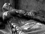
The Se is Lisbon's great Cathedral. Built in 1150, it holds many tombs within its solid Romanesque walls. Among them is this striking marble sarcophagus of Lopo Fernandes Pacheco, companion in arms to Portugal's King Alfonso IV. Sword in hand and a dog at his feet, Pacheco fought alongside of Alfonso at the Battle of Salado, turning back the final invasion of the Moors in 1340, not far from Gibraltar. To make this more than a literal postcard shot, I moved in with my 24mm wideangle converter, deliberately distorting the image by making the hands on the sword and scabbard larger than the head. Most photographers would have probably backed up and included the entire sarcophagus, giving equal to all parts of it. Yet this man, who has been dead for almost 700 years, was a fighter, and that is why he is still remembered. My interpretation of this tomb rests in who this man was, not what the tomb itself looks like.

(Subsequent comments by Jen Zhou and Marek Warno have convinced me that there is really an element of futility in this scene. As such, black and white offers a stronger form than golden marble to cloak this darker story. And so I have converted this image to black and white. Your comments are welcomed.)

Canon PowerShot G5
1/13s f/3.0 at 28.8mm full exif

other sizes: small medium large original auto
share
Phil Douglis17-Aug-2006 21:49
Thanks, Ceci, for your observations as always. I can't comment on the historical and political issues you raise, but I am glad this image has been worth its weight in black and white to you. My emphasis on the hands is what made this image expressive as opposed to descriptive.
Guest 17-Aug-2006 05:25
What an amazing conversation about Ol' Lopo Fernandes Pacheco, above, the perpetually prepared knight at arms, who hopefully lived a short life, thus sparing lotsof lives. Could he be one of the reasons that the "moors" of today are so angry with Christians? Did all this animosity start back then? Probably! Men and their infatuation with weapons is why the planet is continuously at war. It began with our earliest ancestors (as in Kubrick's 2001: A SPACE ODYSSEY) when they learned how dominating they could be waving and pounding large bones above their heads, and has gone on unabated.

But seriously, in "discovering" the hands-larger-than-the-head and triantle elements made me really look at this image in a whole new light. Thanks for the excellent mini-lesson of this page, which I found totally fascinating.
Phil Douglis13-Oct-2004 17:37
Hi, Jen,

I'm thrilled that you think this picture works a lot better now--it has come a long, long way for you since you first commented it. You are absolutely right about the shallow depth of field. Apparently I did focus on those hands afterall, because now that the picture is in black and white, I can see that they are a touch sharper than the face. This helps us accomplish our goal of stressing the hands on the sword.

Thank you, Jen for this comment, and for your continuing participation in this cyberbook. You are using my images as I intended them to be used: you have learned something from every one you have commented on. I am always impressed by the way you are now continually challenging my thinking -- you tell me exactly how you feel about it, what it says to you, or how it fails you. And more importantly, you tell me why.

Your challenges force me to think through each picture anew, and sometimes your views cause me to change my own mind, as with this image. Your growing presence here in my cyberbook raises many issues that might otherwise go unnoticed. I am thrilled that you say you continue to learn from each and every comment you leave. You have become as much of a catalyst to thought here as my images themselves. It works both ways, Jen. You can learn something new from each picture you visit, and we can learn something new from you as well. I look forward to many more of your astute comments, questions, and criticisms.
Jennifer Zhou13-Oct-2004 05:30
I really like your new B&W vision Phil, and you make it even darker which I think just perfect for the story!

When the warm color is out, I notice there is a shallow depth of field and focus is indeed on the left hand and the sword! You don't need PS to achieve it, you already have it there!

I am so happy you agreed with my idea of futility of man..haha..I learned that idea from you on that Big Jim Larkin shot, instead of that, I see it here in this picture! You see I can learn many things from each of your pictures, and I should really thank you for that!!!

Marek is so right, we need to ask those questions before we make the decision either to use color or mono. Mono is already a form of abstration and as Mareks said which I agree that it can be easier controled sometimes than the color.

Jen
Phil Douglis12-Oct-2004 20:43
I agree with everything you say here, Marek, particularly the first question. We are dealing here with form. The story is the content, which is always more important than form. So it makes sense to ask this question first. If color helps tell the story, or if color itself is the story, we must use color to express our idea. However if color creates meaning that runs counter to the story, stark, somewhat harsh black and white becomes an obvious choice. Once Jen convinced me that this image is really about the futility of trying to deny the reality of death, black and white became the choice of form. My original idea, about this guy making himself immortal by continuing his fight, was better served, I thought, by my warm, golden color image.
Guest 12-Oct-2004 20:16
Straightway, in B&W the image gains more power. In the past, I used to have many dilemmas whether to use colour or mono. Nowadays, I resolve the question like this: Does the colour add to the story, or does it harm it? As when a red object away from the subject can sap attention away from it. Does the colour make the image more attractive? In this case it definitely didn't. Does the colour limit our ability to imagine? Often it does, but does the removal of colour, remove us from the experience? That can happen also, especially with documentary images or some landscapes. Is monochrome easier to control from an aesthetic point of view? Yes, it. Therefore, let's not forget the challenge of colour...
Phil Douglis12-Oct-2004 17:50
I agree with with what Marek and Jen are suggesting here. This colorful image was entirely satisfactory to me as an interpreter of history, but Jen is still bothered by its warmth and suggests black and white instead. Jen makes a solid case for black and white by suggesting a meaning quite different, and much more powerful, than the one I originally intended to express.

She feels that no matter how brave a fighter this fellow was, and no matter how much he wants to fight, even in death, the reality of it is that he is dead. He can't change that fact. She feels that this image is really about the futility of man. Jen, you have convinced me that this image would more powerful with both a new message and a new form. I had wanted to infuse this scene of death with the color of life, emphasizing his will to keep on fighting. But after taking your new meaning into account and looking at Marek's suggestions, I agree with both of you. Let us leave the reality of the golden marble here and abstract it down to its essence. Let me change it black and white. And I want both of you to come back and look it in its new form.

As for changing the focus to make the hands sharp and the face blurred, I wish I had thought of that while standing before this tomb in Lisbon's great cathedral. I do not have the Photoshop exertise to do what Marek suggests here, so I can replicate it. '

Both of you have learned much from critiquing this image. And I have learned even more. The bottom line is this: form must fit the meaning. Both of you feel that black and white is a better fit for a message that I did not orginally intend. Yet Jen saw a meaning here that went well beyond my intentions. And I agree -- if we are now taking about futility , black and white is a much better fit than this rich warm gold marble.
Jennifer Zhou12-Oct-2004 15:47
Phil,

You once said "form is structure, form clarifies, emphasizes, and organizes our content." As what I think it, form includes the the way we composite the picture, the way of using lights, the technical effects we want to use, the choices of using color or monochrome, the shutter speed and the aperture~~many many small things...

You explained your composition is one of the most powerful form--triangle which I agree (also is the first time I learn about it--thank you for teaching me this:).)
But you may failed on other kinds of form which makes me feel less satisfied with this picture, that is possible right?

I was trying to raise the issue of the your warm tone, even you made your point but I have to say it still bothers me~ He is dead, and that is the reality no matter how brave he was, how much he wants to fight again, he can't change the fact..That is the futility of man right? And the B&W can be a good form on that story!

Marek seems prefer the B&W too, and he is giving a little digital darkroom illustration here~:)
The step 4 is an example without words telling us to focus on the hands~ are you OK with that Phil?

Jen
Guest 12-Oct-2004 10:45
Having readeth thy discussion, here be my thrupence.

Firstly, I don't think there is anything wrong with the composition with regards to what Phil was trying to achieve. The unsettling impression Jen is describing results from the feeling of movement, which is deliberate to the illusion of drawing the sword. The slight incline of the sword implies it is drawn up, and the general approach de-emphasised the face, accentuating the hands. The end of the sword handle is on the thirds, where it is the strongest. Notice also that Phil has kept the corner support behind the knight's head vertical, which reinforces the stone solidity. (That's just a good habit that comes with experience ;-)

My main gripes are with the final aspects of execution and presentation. I've created a little example story to take you through my cognitive steps.

Step 1
Whatever you may say about golden/bronze/rich connotations, for me this image has no justification for being in colour. In this instance the colour is 90% responsible for the image's lack of aesthetic appeal. To compound the problem, the refracted spectered light stain towards bottom right, confuses rather than enhances the message. It's just not strong enough to ‘give the stone life’.
Turning the image to monochrome solves these problems.
http://www.pbase.com/warno/image/34966574

Step 2
After a straight conversion, it lacks contrast, or a ‘bit of punch’. I've increased it slightly, making it all lighter and less moody as a result, but wait, I haven't finished yet...
http://www.pbase.com/warno/image/34966575

Step 3
I have a very simple rule; the eye always goes to the area of focus and to the area of light. It's no good selectively focusing on the key part if the surrounding areas sap the attention away by virtue of being much lighter. This is what's happening on the original image, made worse by the fact that the face is such a strong attention-grabber. We need to remedy this. Fortunately, monochrome has one huge advantage over colour; it allows you to manipulate light and shade in post production (call it darkroom, if you must ;-), to a greater extent whilst still preserving credible reality. So I created a smooth oval quickmask with which I was able to darken everything except for the hands, restoring the original mood in the process.
http://www.pbase.com/warno/image/34966576

Step 4
We are almost there, but as I didn't want to overdo the halo differential which would have created in an unnatural result, the emphasis of the hands isn't quite there yet. The final remedy comes in the form which should have been employed at the point of taking the photo, had Phil's (Leica Digilux 2?) allowed for it: A larger aperture. This was one of my original gripes; the DoF differential in the original image is neither meat nor fish, creating ambiguity. This is easily remedied. With my oval selection still active, I simply Gaussian blurred the supporting image and Unsharp Masked the hands a little. Hey presto! We now have f1.8, or therebouts. Job done.
http://www.pbase.com/warno/image/34966577


Phil Douglis11-Oct-2004 18:17
One more point I forgot to mention in my response to you below, Jen. Yesterday, when you criticized all that clothing at the bottom of the picture as being useless, I at first agreed with you. Last night I tried to crop this picture and noticed how by removing the clothes from the frame, I robbed the face and sword of context and limited the thrust of the triangular form I describe below. So I have changed my mind about those clothes. They are essential to both content and form.
Phil
Phil Douglis11-Oct-2004 16:55
Hi, Jen,

I am delighted you see my picture through new eyes, and even more delighted that are now enjoyiing challenging me on my pictures and are learning so much from the process.

As for your two remaining concerns -- that this image is not aesthetically attractive and that it does not have good form -- here are two point for you to think about and possibly learn from:

First, an image need not be aesthetically pleasant to have an effect. A picture of a dead man holding his sword is not the stuff of pleasure or beauty. While not ugly, it is not intended to be soothing or attractive or lovely. It is intended to speak of death and war and history. So perhaps you applying an inappropriate aesthetic standard to this image, Jen.

And secondly, as to its form, I urge you, Jen, to re-examine and take into account my reasons for composing it in this way. I composed it with one of the most powerful forms we can use to draw an image together and draw the eye through it. The Triangle. I placed the head in the upper left hand corner of the picture, and draw the eye down through the hands, the sword. Meanwhile, look at the left hand side of the picture. Starting at the head, move down and follow the line of the folded edge of the clothing. It carries your eye down to the bottom edge of the picture, right?. And finally, look at the crease in the clothing in the lower right hand corner. It carries your eye from the edge of that clothing across to the sword. If you draw three lines on this image as i've just described, you will have a triangle.

Do you see it now? Do you still feel this is not good form?
Jennifer Zhou11-Oct-2004 13:33
Phil,
It is even a surprise to me that I don't feel a bit awkward when criticizing your pictures! I am so excited to challenge you~ and it always turn out to be a learning experience for me which is what I love!

This time you convince me again! I thought about the hands on the sword is making a point here but didn't make my thoughts going even farther. When you pointed out the incongruity of dead man still ready to fight, I feel so released to finally get your point which is surly a remarkable one and for that, this is not a shitty picture anymore!

I always love how you try to exercise our brains by not writing out your whole ideas but only give us some basic context and stimulate our thoughts..

I do love your idea, and I do see it differently now but I still don't like this picture very much, it is just not aesthetically attractive to me and I also have a high standard for Phil's work--not only successful in the content but also in the form! How would you like that Phil? Do you agree I said you don't have a good form here?


Jen
Phil Douglis10-Oct-2004 17:12
At last, a critical comment from my friend Jen. Let me give you my thinking on each of the excellent points you raise here. Then look at the picture again, and let me know if you still tbink it is a shitty picture or if you can see the meaning in it.

You kept turning your neck to see this picture because you are not accustomed to seeing people drawing their swords while lying down. This sculpture is on a tomb, Jen. He is dead. He was a warrior. And he still is pulling his sword out of his scabbard. That is incongruous, and it is this incongruity that is at the heart of the picture. You keep wanting to turn the picture vertically because that is the way people should look when they are grabbing their swords, right? Now look at it again, and see the man as dead -- yet pulling on his sword, and you should see an entirely different picture.

Second -- the face is not important. The hand on the dead man on the sword is very important. That is why I moved in on it. To stress it. To tell the incongruous story of a man who has been dead for 700 years and is still fighting.

I do agree with you on one point, however. There is two much emphasis on the clothes. I should have cropped the picture starting at the base of the sword. How would you like it then?

As for the warm tone -- I tried to convey the warmth of the marble tomb itself. Instead of the cold color of death, I tried to infuse the image with the warm color of life, further intensifying the message I am trying to get across.

Once a warrior, always a warrior. Even in death, his fighting spirit lives. That is the message you did not see the first time, Jen. Do you see it now?

Thanks again for the criticism. I hope it will be the first of many critiques, because each time you are tough on a picture you will learn much from it. Did you learn anything from this?

Phil

Jennifer Zhou10-Oct-2004 14:40
Phil, this is not a postcard pretty picture but it is not a good picture to me either!
First, It is a picture not very comfortable looking at, I found myself keep turning my neck around trying to see this man vertically, but when I revert it in PS, it doesn't work vertically either! I really expect to see mort context here to get the idea!
Second, I am looking carefully at this man but still hardly understand this picture, his face--very important part, is placed far away in the corner so I can't read much from it, and his hands on the sword do tell the story but not very strongly to me. And you used more than half of this picture showing this man's clothes which contributes nothing to your story!
Third, I think the warm tone doesn't help to tell the story!
What do you think Phil? Is this one of the shitty picture you left for us to discover?

Jen
Type your message and click Add Comment
It is best to login or register first but you may post as a guest.
Enter an optional name and contact email address. Name
Name Email
help private comment