


|
|
|
|
|
|
| |
| 14-Jan-2021 | |
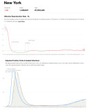
Note - this doesn't show actual positive tests.
The number of daily positive tests in January 2021 is higher than in April.
This graph adjusts positive tests for the number of tests done. Then, it calculates an implied infection curve. This uses a known distribution of how much time passes between infection and a confirmed positive report.
| comment | |