I felt very stupid when approaching Karataş in the dolmuş. In my hometown Amsterdam I had been advised to pay it a visit, and only during the last kilometer I realized I’d done precisely that a year earlier. I decided not to visit the classical city, as it is miles from the centre, and would probably show hardly any extensions of the excavations. So I just strolled along the coast, enjoying some new sights, and then back to Adana.
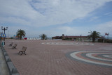
In the left corner we are told to love Karataş. In Amsterdam we have a similar logo. And here is a text about the original: "One of the most widely distributed and imitated images in the world, the “I Love New York Logo”—consisting of an upper-case “I,” followed by a red heart symbol, and then the upper-case letters “N” and “Y,” set in the rounded slab serif typeface American Typewriter—was created by graphic designer Milton Glaser and first used in 1977 to promote the city and state. Let’s dive into the history behind the creation of this iconic logo. New York was going through hard times in the 1970s. Crime was at an all-time high, and tourism was at an all-time low; in 1975, President Ford denied federal assistance to save New York City from bankruptcy, and 1977 saw a widespread blackout that led to extensive looting and 4,500 arrests. Tourists stayed away from New York as a result of the negative publicity that followed. The New York State Department for Economic Development tapped Madison Avenue advertising firm Wells Rich Greene to create a tourist-friendly campaign to encourage visitors to The Big Apple. The agency soon established several central components of the campaign. They had a slogan (“I Love New York”), a jingle, and a television commercial highlighting Broadway theater. Still, they lacked a logo. Enter Milton Glaser, whose portfolio up to that point included a portrait of Bob Dylan enclosed in the singer’s greatest hits album, the design of New York magazine which he founded in 1968, and the visual identity of the restaurant in the World Trade Center. Glaser was recruited by the Department for Economic Development to meet with Wells Rich Greene about logo options for the New York City campaign. During the meeting, Glaser pulled a crumpled piece of paper out of his pocket with a doodle he’d done during a recent cab ride. On the back of an envelope, he had scribbled the logo that we know today, and after the concept hit a nerve for Wells Rich Greene, he proceeded to develop it further, stacking the characters and determining the typeface. Glaser did the work entirely pro bono, in the name of helping the city rise again. “That’s what it should be,” he told graphic designer Chip Kidd in an interview in The Believer. “You want to do things like that, where you feel you can actually change things.”
Today, the New York State Empire State Development (ESD), New York’s chief economic development agency, holds the trademark to the “I Love New York” logo, and licenses its use."
Compare to another case