


|
|
|
|
|
|
| |
| 28 Mar 2012 | |
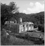
Hasselblad 500CM
Carl Zeiss Distagon C 50mm f:4
Delta 100 B&W film developed in Microphen
Scanned from negative with Canoscan 9950F
All images copyright Antonis Sarantos
| Graeme | 31-Mar-2012 18:10 | |
| Marisa Livet | 30-Mar-2012 11:28 | |
| Chris Sofopoulos | 28-Mar-2012 21:23 | |
| Guest | 28-Mar-2012 21:03 | |