Part of an online critique here: http://www.redbubble.com/groups/photography-critique-and-advice/forums/4108/topics/151093-first-attempt-at-hdr
Pleass note that this is NOT my Image!!!!!
The Critique:
Hi Handie,
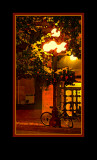
The main issue I have with the image is that the light globes of the street light are just too bright� Notice how the bright spots DEMAND that our eyes keep going back to those hot spots over and over and over� So unless the streetlight is the primary subject, the Streetlight globes are just too bright and dominate the image.
I wish there were more detail in the (dark) bicycle.
I do like the mood, but the golden colors are perhaps a bit dominant. As a general rule, if there is at least one area of color in the image that is solidly in the realm of �believable� then we will accept all manner of extreme colors around it. For instance, if the blacks are crisp and neutral or there is a neutral gray area or a clean white somewhere�. then it all works. The only such color is the pure white in the extremely bright streetlights, but we expect those to burn out to pure white anyway, so they don�t count. If the white wood trim around the windows were a believable white, then the colors would work. the blacks are not pure and look greenish or reddish depending on where you look. The concept is called �Frame of Reference� (credit to Galen Rowell); viewers need something with which to grasp onto that they recognize so that they can begin to understand and then accept the image.
And yes, I understand the challenge when shooting under such near monochromatic light sources� (It is interesting how well our mind�s perceptions will correct for the most extreme color conditions but that our cameras can�t�.)
After pondering this a bit more�
OK, Back to an inquiry when I�m not really sure about an image and what to do with it�.. What�s the most important aspect of the image?
I would have to say it�s the interesting play of light
If we say everything else is subservient to the light and the other aspects have challenging colors to wrestle with, then sometimes I try a more extreme interpretation and play with the PS filters, in this case a dry brush watercolor effect. That plays up the interesting light and lets everything else (with the challenging colors) step back and become less important.
See what you think of this interpretation that emphasizes the play of warm light and then pushes the colors to more of a red/green contrast to emphasize the warm colors in the bright areas and the cool (green) colors in the dark areas. And yes, I do like frames.