Thank you, MFC, for taking the time to analyze all four of my entries! I do understand what you mean when talking about the various possible crops (and I can see what one could gain); but most of them would lead to abstracts, which was not my aim when taking this image (as they would, indeed, tell a different "story"). -- db.
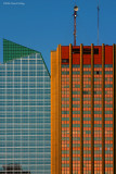
I love the crisp detail and color contrast of this photo, Daniel. I think there's a lot to see here, but a number of things help simplify the scene for me...the monotone sky...the repeating, similar patterns and basic shapes of the two buildings...and your choice of comp/crop here. Because of these things, my eye is drawn right to the details and differences at the tops of the buildings. I have fun imagining various other crops that would eliminate most(or all) of the sky and some(or all) of the "top" details here...and they would all tell a slightly different "story". Nice photo! MFC
Thank you, arn, for your kind words! I do think it's the simple colour-scheme on one hand and the--mostly--straight vertical and horizontal lines that make this composition work: it is one of the most successful images I ever took... -- db.
I see that you like simplifying the scene by using tiles... It's a faschinating approach and achieves eye catching results. There's a lot in this image, but then again, it's formed from simple elements and right-angled lines. I spent quite a bit of time looking at this one.